All cosmetics at your fingertips.
A curated catalog of globally accessible cosmetics, health, wellness, and beauty products to satisfy a plethora of refined tastes.
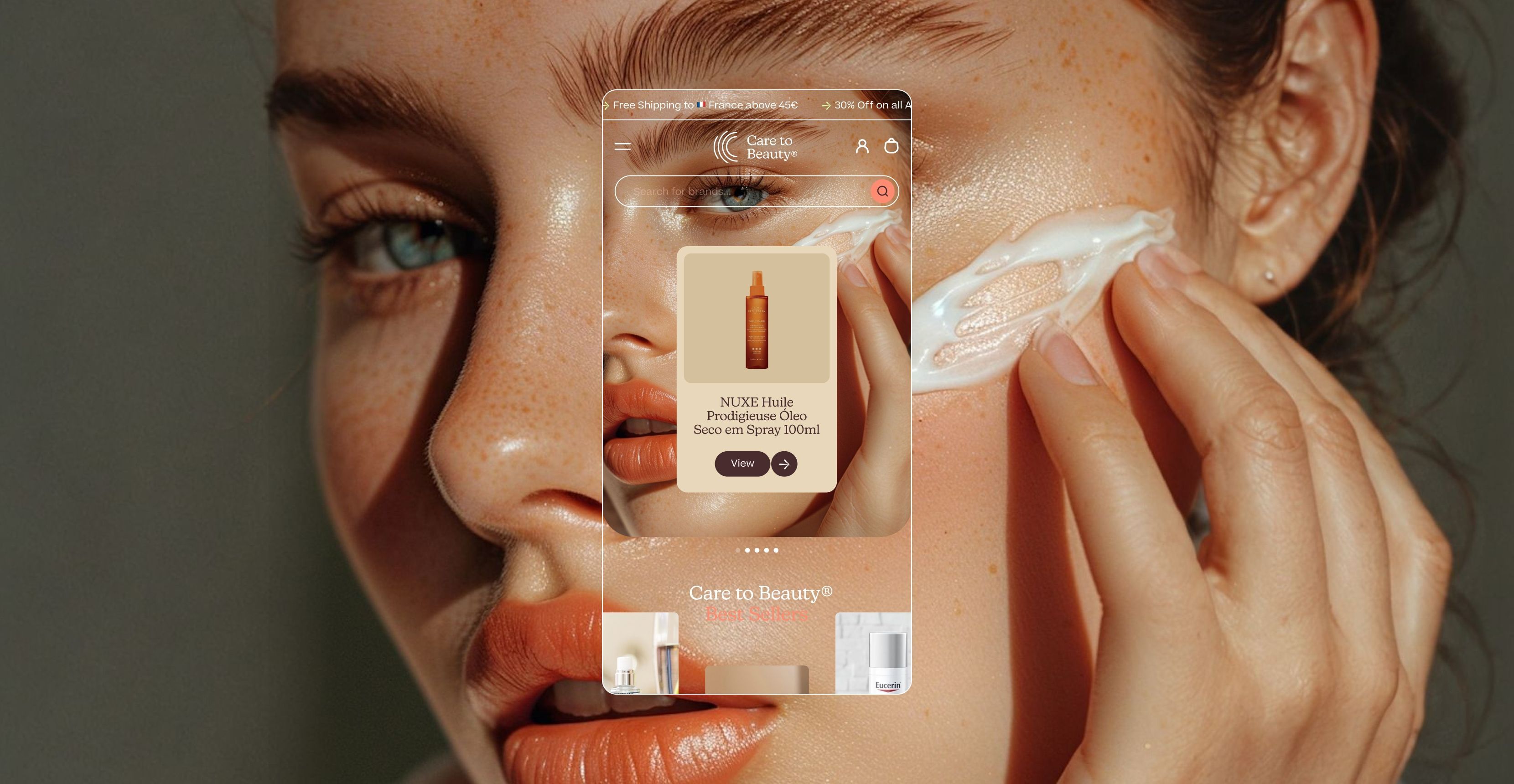
Care to Beauty is committed to grounding your beauty and skincare journey, no matter where you are.
Care to Beauty believes you deserve access to the finest products. Their extensive catalog offers a diverse range of cosmetics, health, wellness, and beauty products tailored to meet every need and preference, all accessible globally.
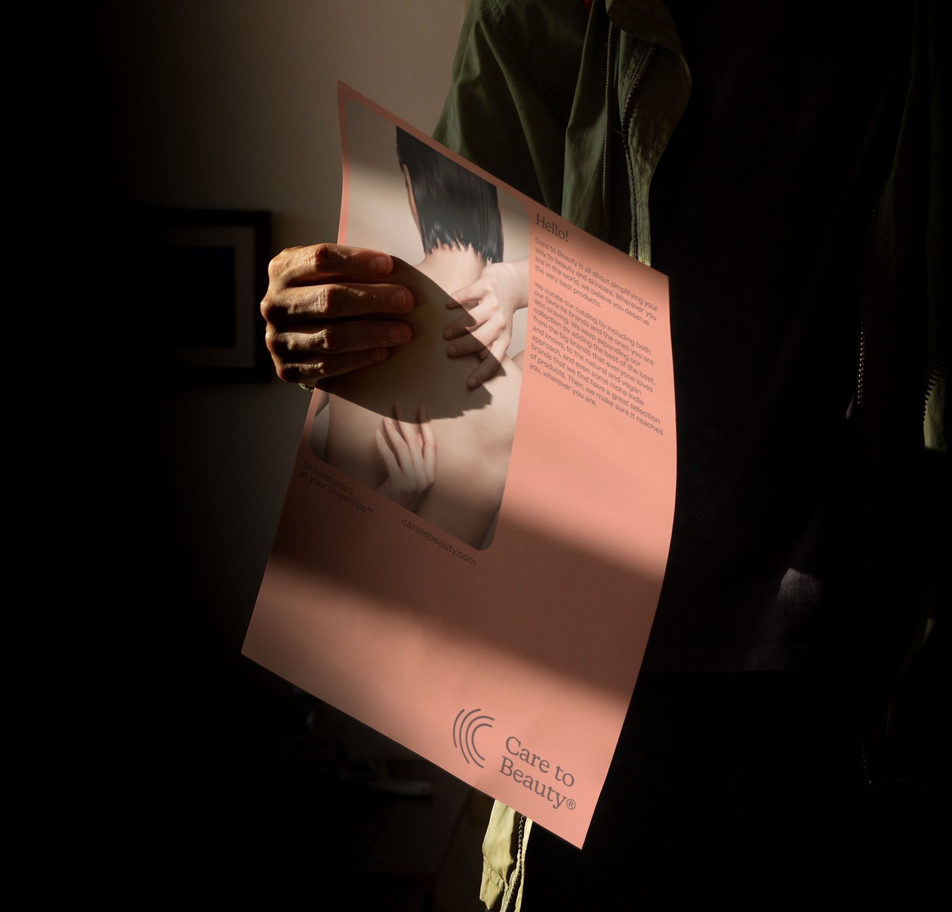
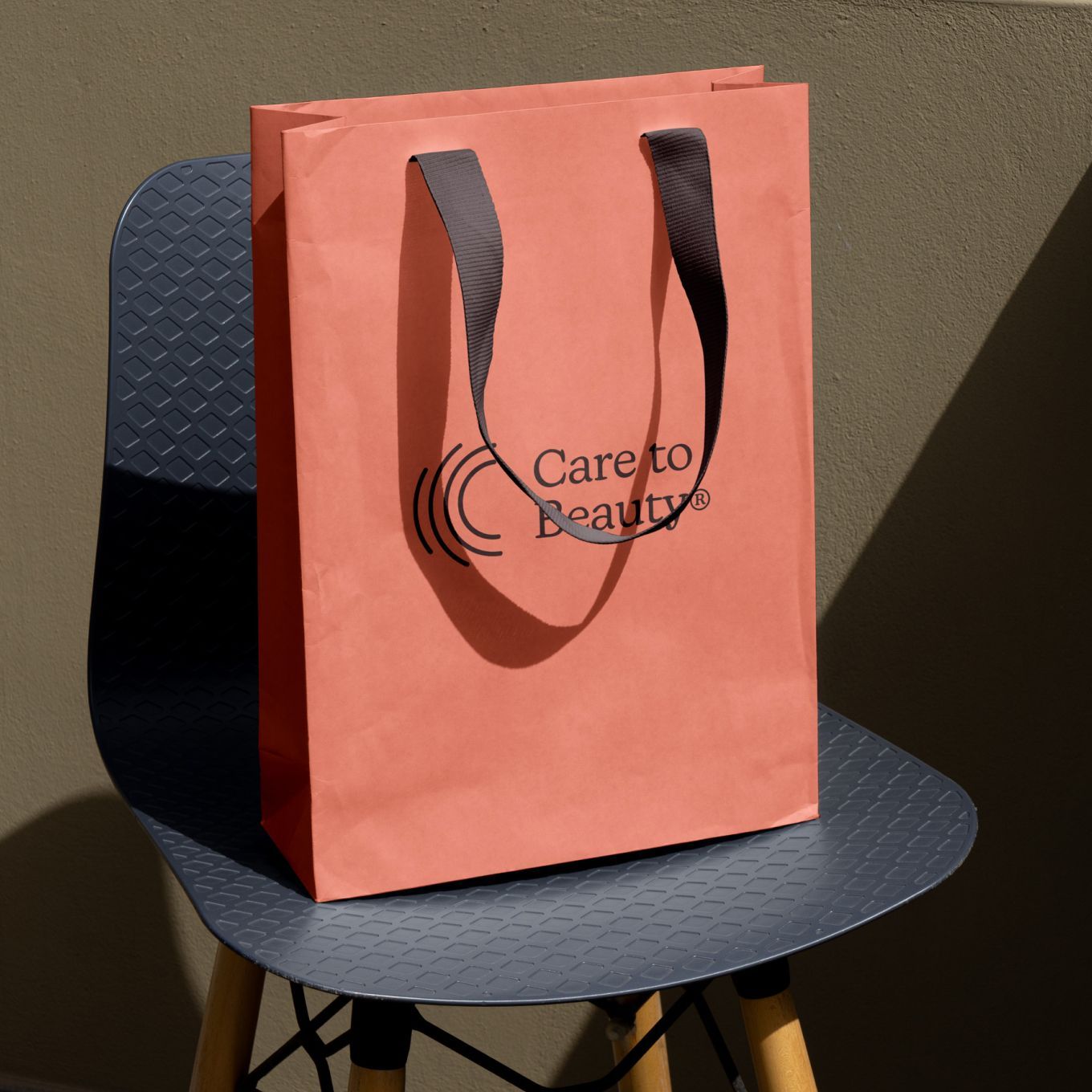
All cosmetics at your Fingertips™, as the briefing stated from day one. The logo captures this essence with a beautifully shaped 'C' resembling a fingertip, embodying a brand that genuinely cares about your unique beauty.
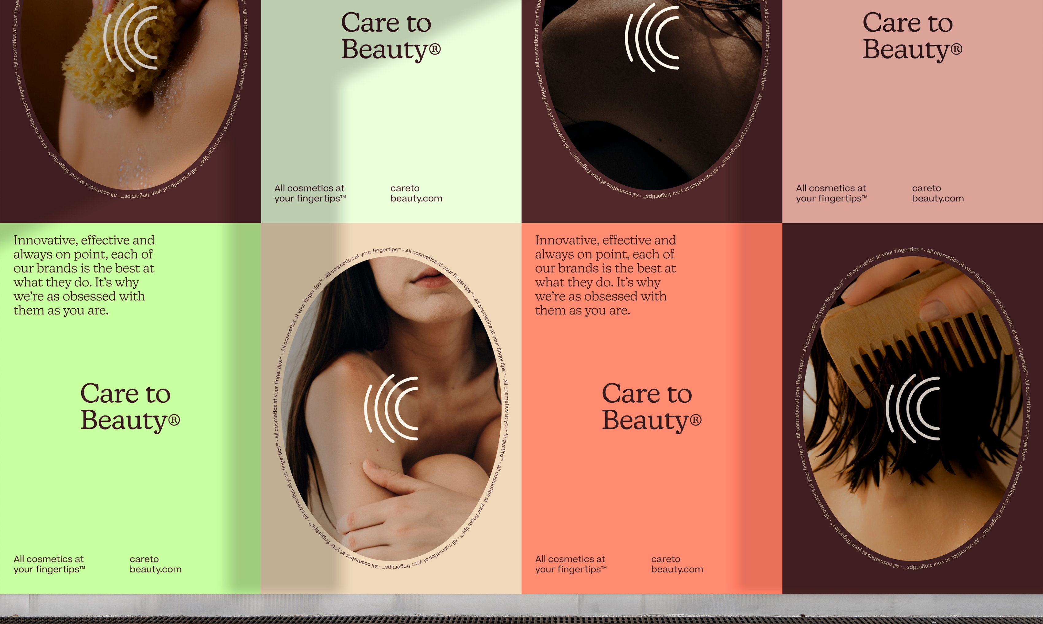
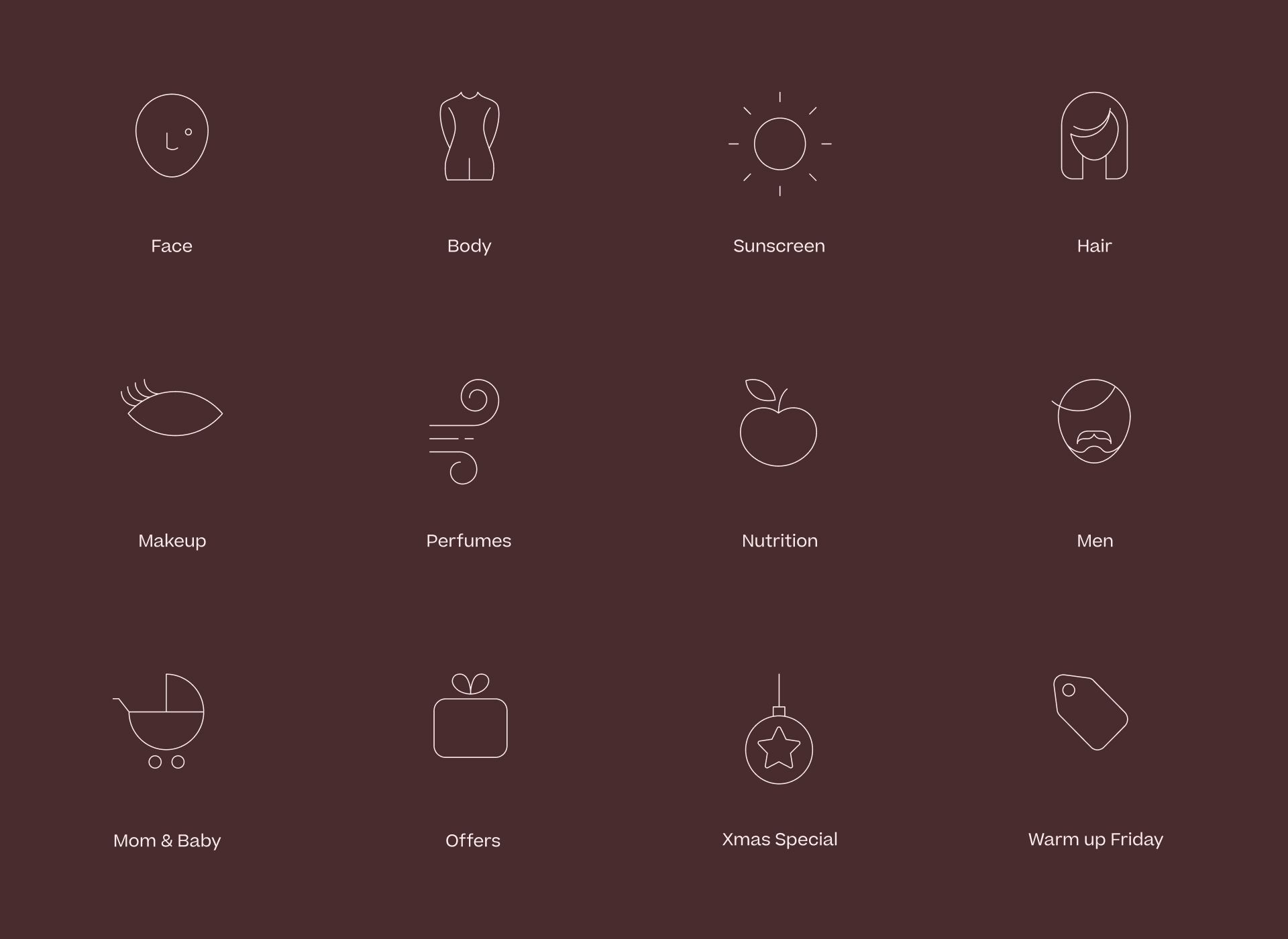
The oval-shaped fingerprint, evoking a beauty mirror, serves as the primary brand shape to embrace gender inclusivity, representing diverse identities. This principle guided the creation of outline pictograms, resulting in a cohesive design system that culminated in the new caretobeauty.com website.
Our color palette features warm and cool pastels, allowing for year-round brand adaptability. From Black Friday and Christmas to Valentine's Day, our brand system ensures seamless coverage for all campaigns and seasonal events.
- Brand Strategy
- Brand Guidelines
- Digital Design
- Videography
- Photography
Website
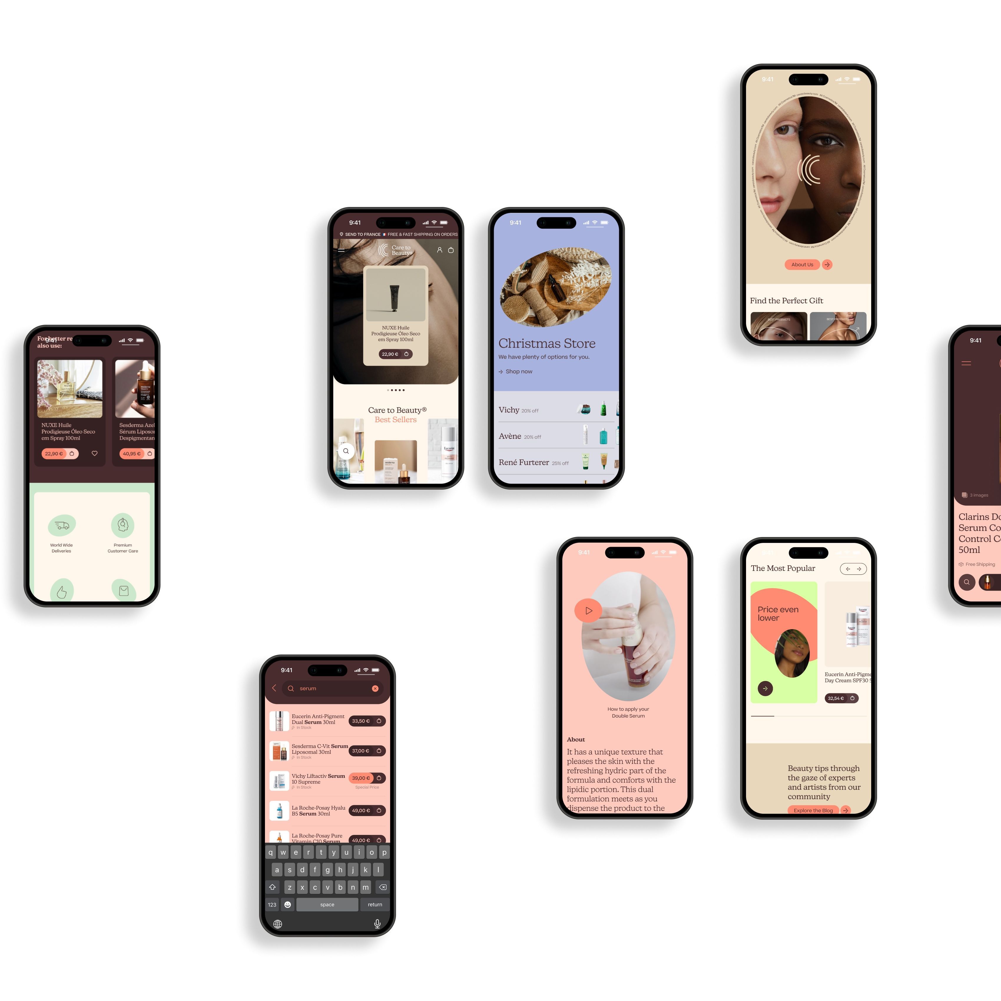
Building a mobile-first, blazing-fast website that Google loves while maintaining polished branding is no easy task. From the outset, the priority was clear: Google first, even at the expense of nice typefaces. No problem—we thrive on tackling the impossible (there's a deodorant for that, BTW!).
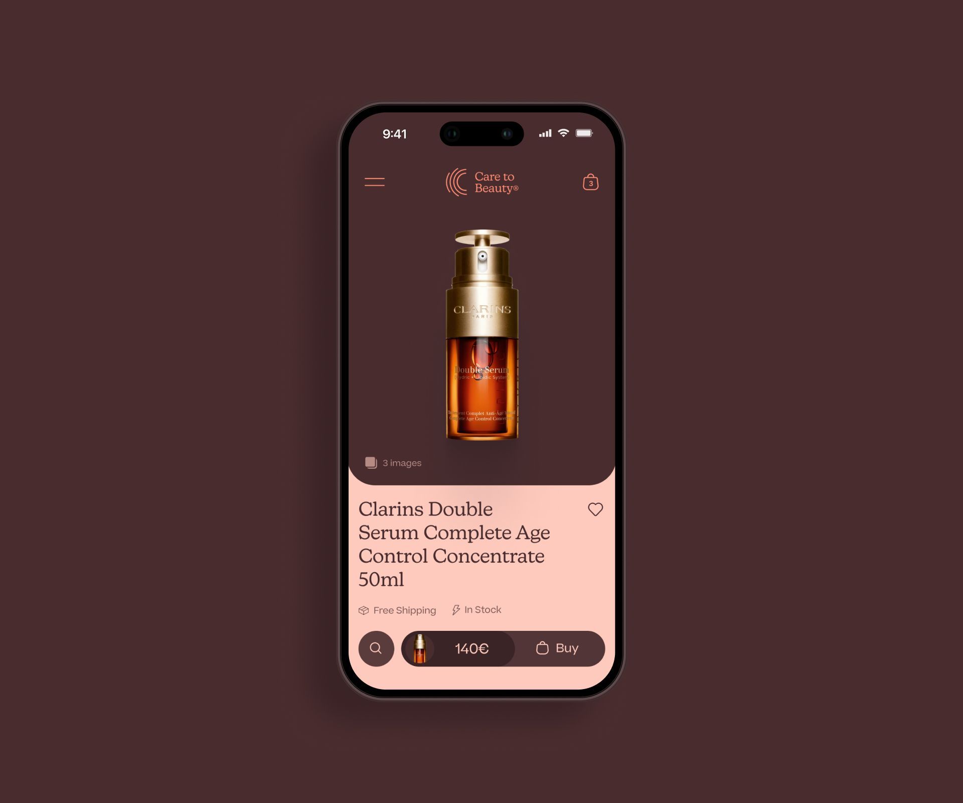
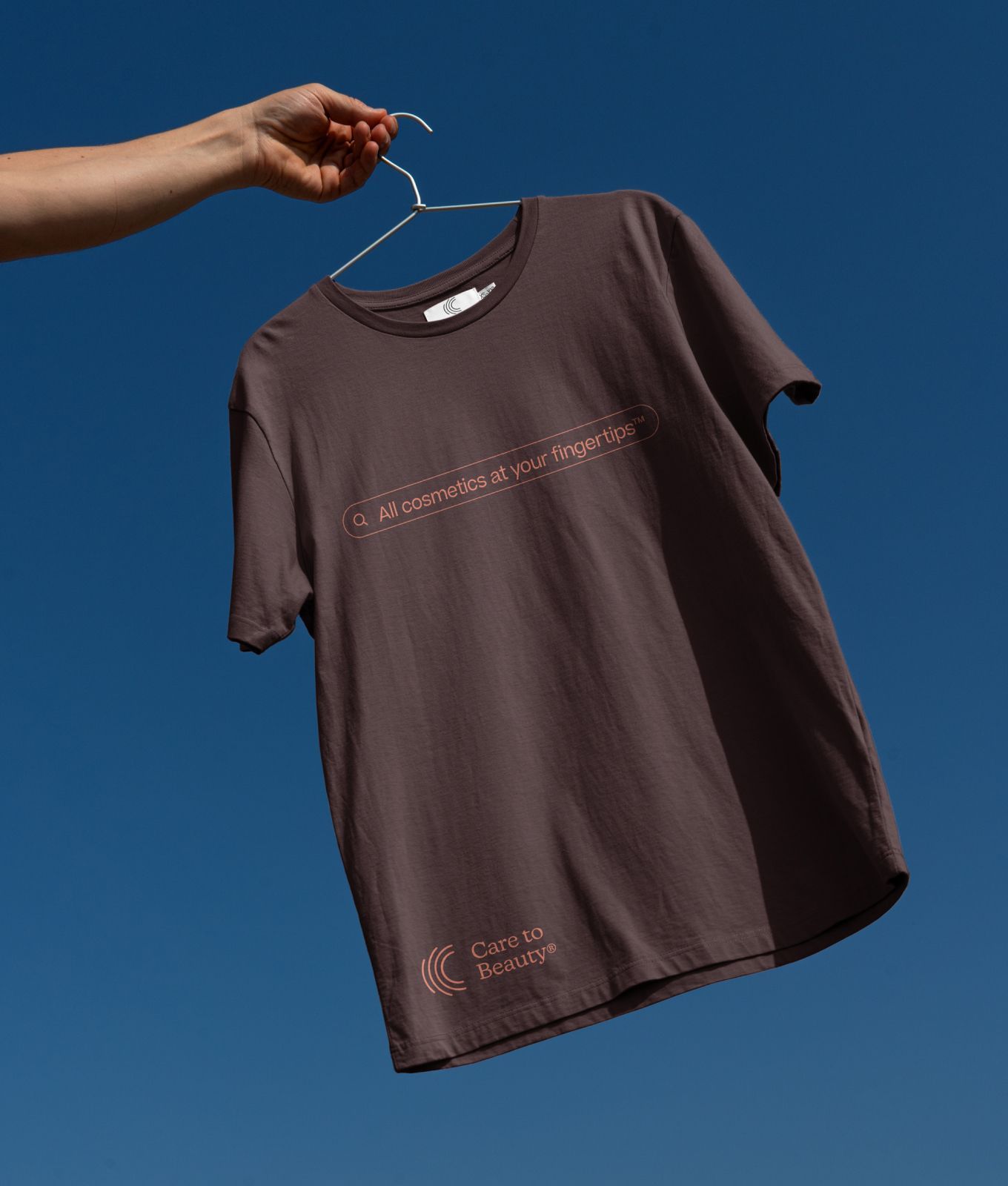
The biggest challenge was designing a navigation system that allowed both new and returning users to quickly find what they needed. The search bar, part of the visual branding assets, and menu became the focal points, generously designed for easy access.
Imagery was centered around product packaging, so the system had to work seamlessly with everything, from low-res white backgrounds to luxury shots.
A strongly hydrated(!) design system ensured that prices and key features were just a glance away, wrapped in warm colors for a touch of elegance. And the rest? Well, it’s just cart history!
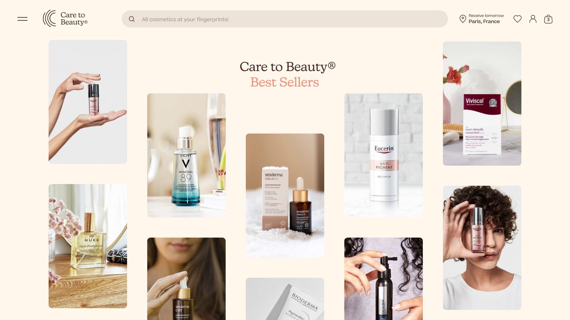
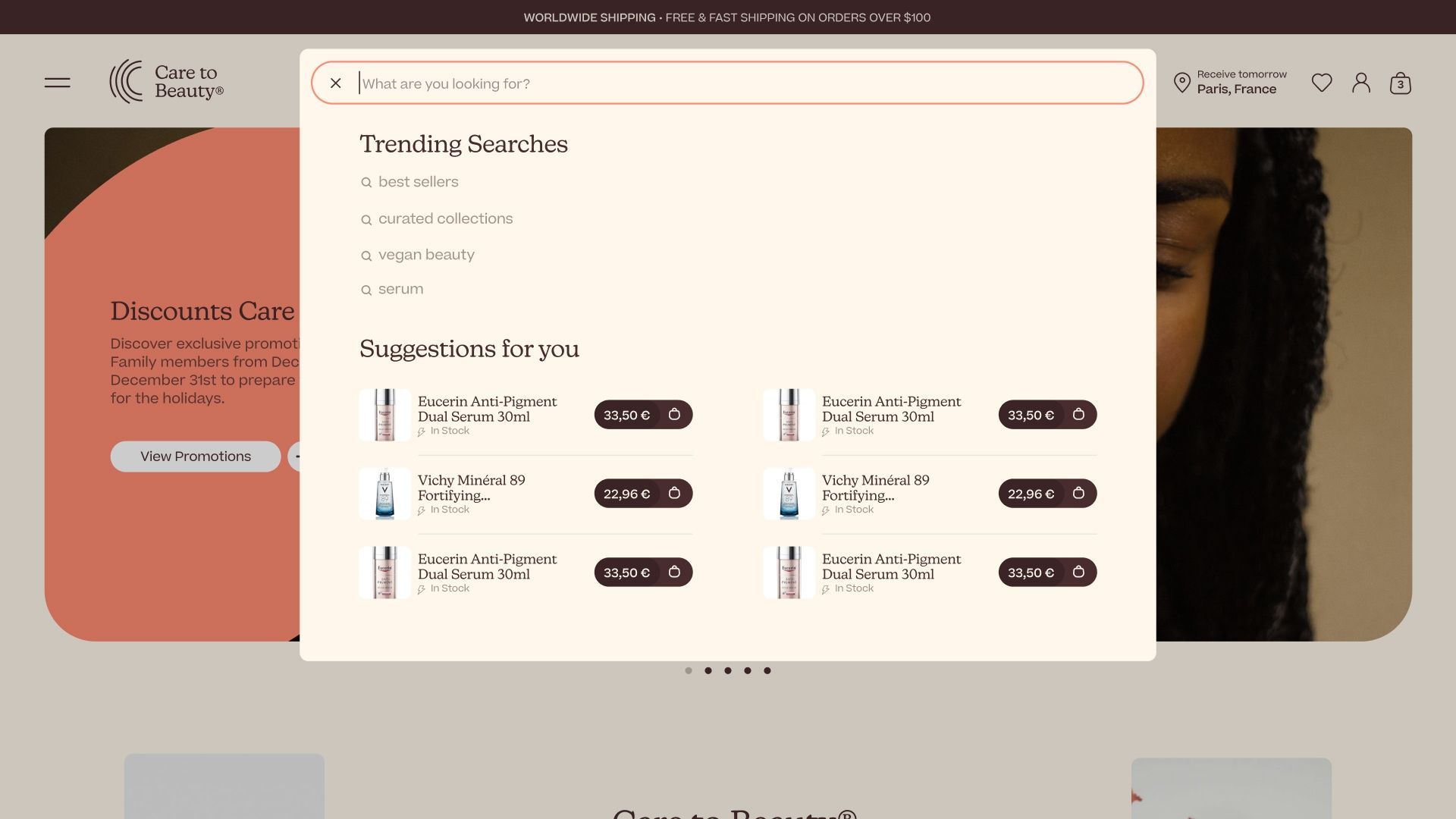
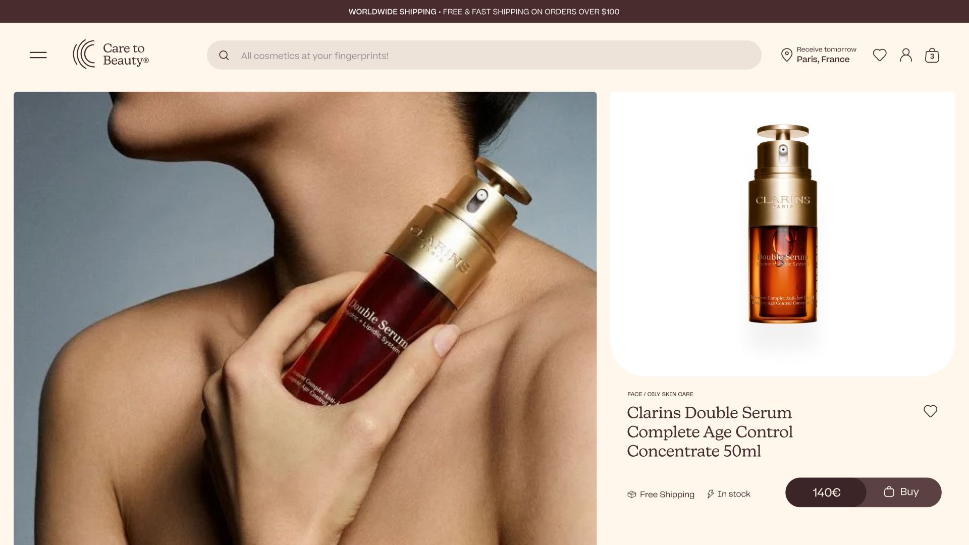

Hey there, beautiful! Care to Beauty brings you the finest skincare products, no matter where you are.
Rebranding
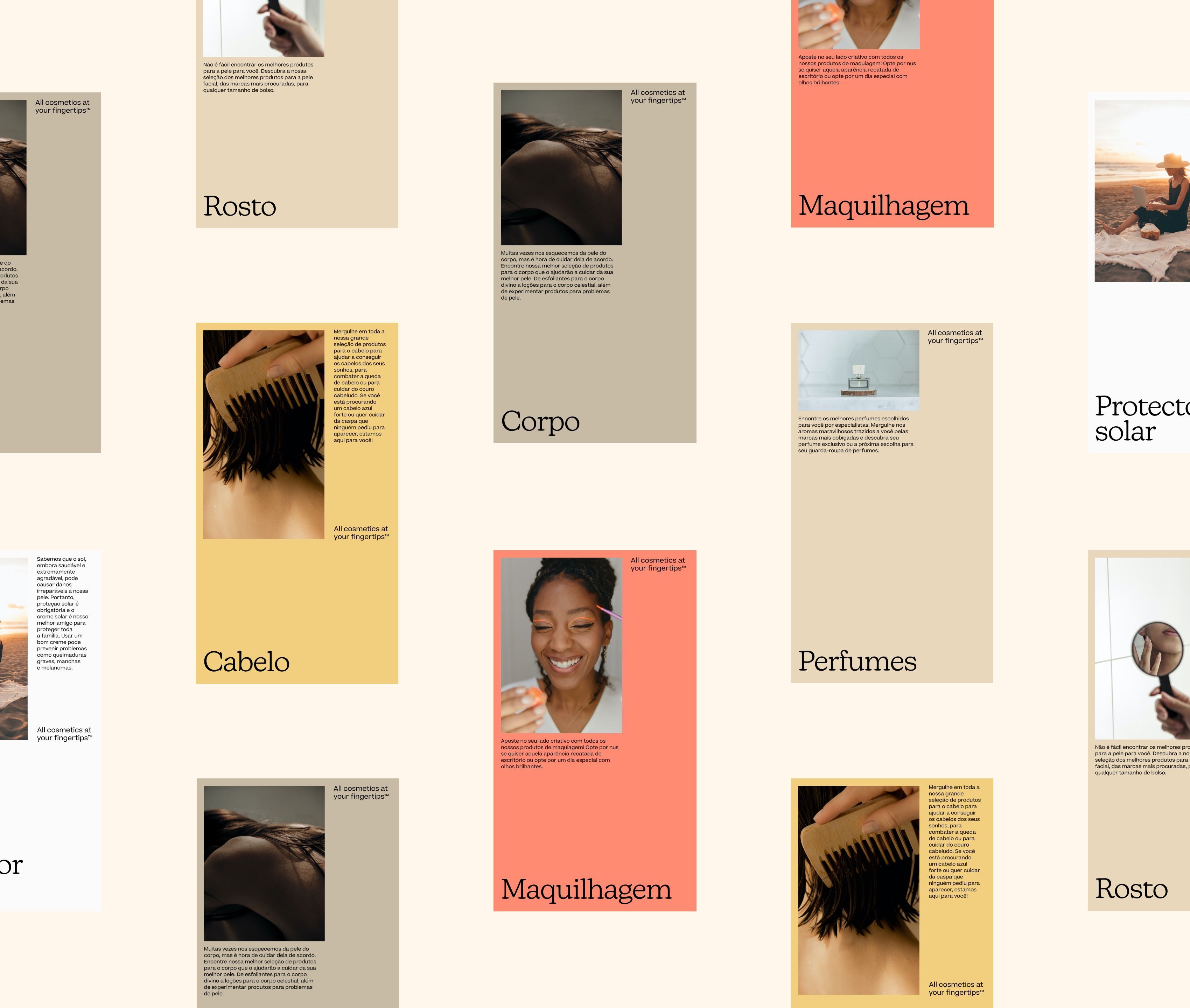
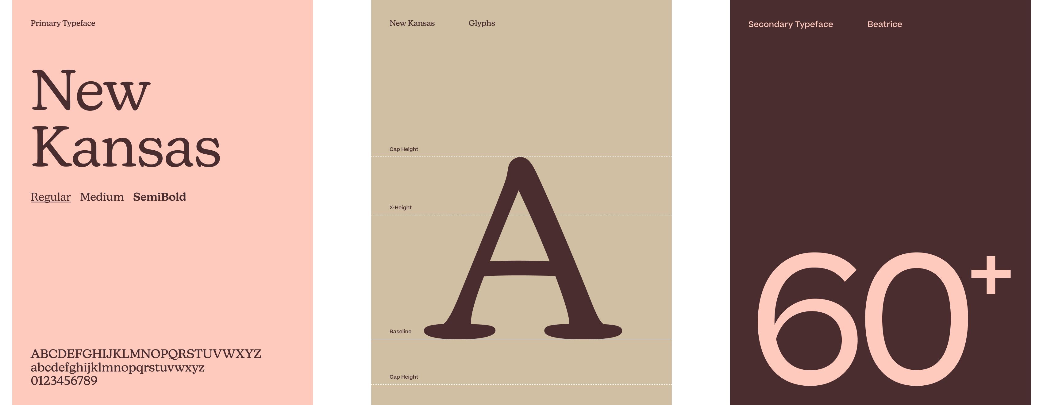
All Cosmetics at your Fingertips™. From smudges to fingerprints and mirror shapes, we crafted a brand symbol directly inspired by the “C” fingerprint outlines, creating a language that extended to the essential website UI pictograms. For typography, we paired the elegant Beatrice with playful New Kansas, avoiding typographic monotony and adding interest to the system.
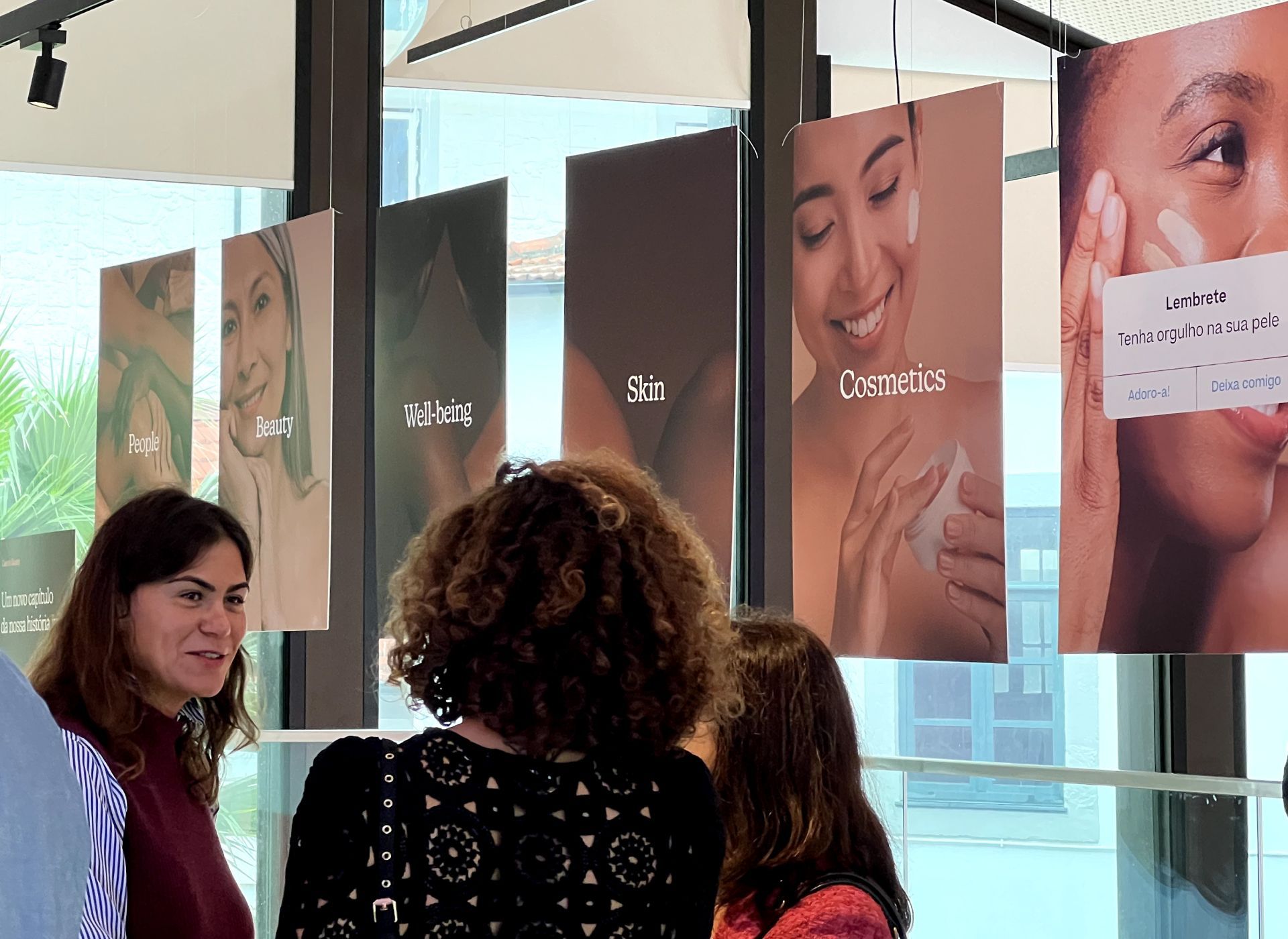
Care to Beauty is all about people, so the color palette reflects warmth, ranging from light to dark skin tones, with coral and moss green providing freshness. The tone of voice is neutral, inviting interaction through touch while enhancing color interplay.
In art direction, we followed two paths: people interacting with products, and products themselves. Both aim to depict peaceful scenarios in a modern, fast-paced world—minimal, fresh, and with a touch of warmth!
Just beautiful.
Büro single-handedly named, rebranded, and built the design system for my life’s project, Care to Beauty. I couldn’t be prouder—everything is perfect, fast, and elevates my company to the much-needed next digital level. For months, the brand was in their hands, and they returned it as a polished, powerful tool for us to thrive. Kudos, Büro team!