Empowering professional services firms to create tailored resumes, CVs, and case studies with ease.
From resume stress, to bid success.
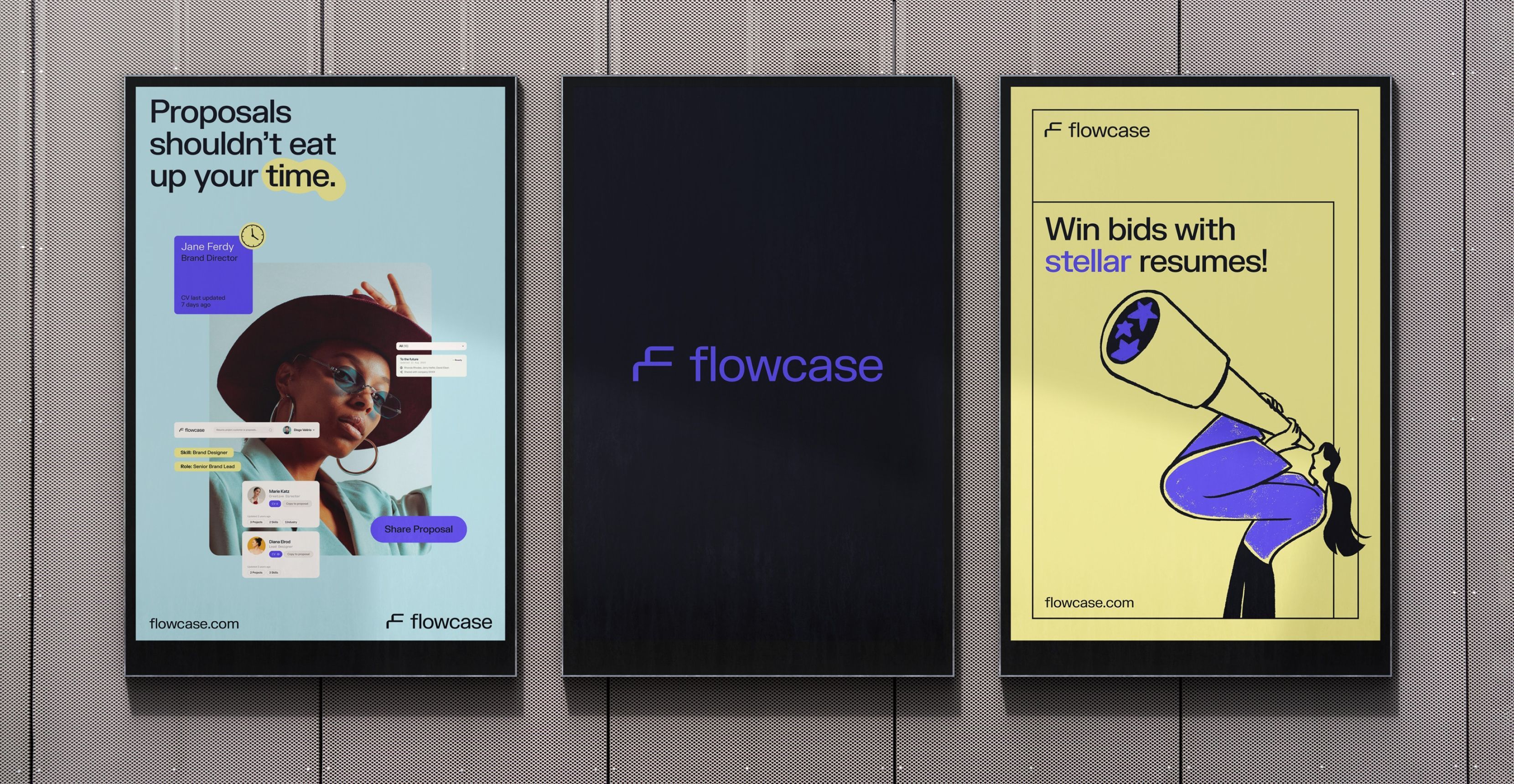
Flowcase automates the process of filtering, tailoring, and formatting professional resumes and case studies, so you can focus on the work that matters.
When the goal is to stand out from the crowd and have your proposal shine without needing flashy gimmicks, Flowcase (formerly CVpartner) is the answer. It simplifies human resources, making everyone’s life easier.
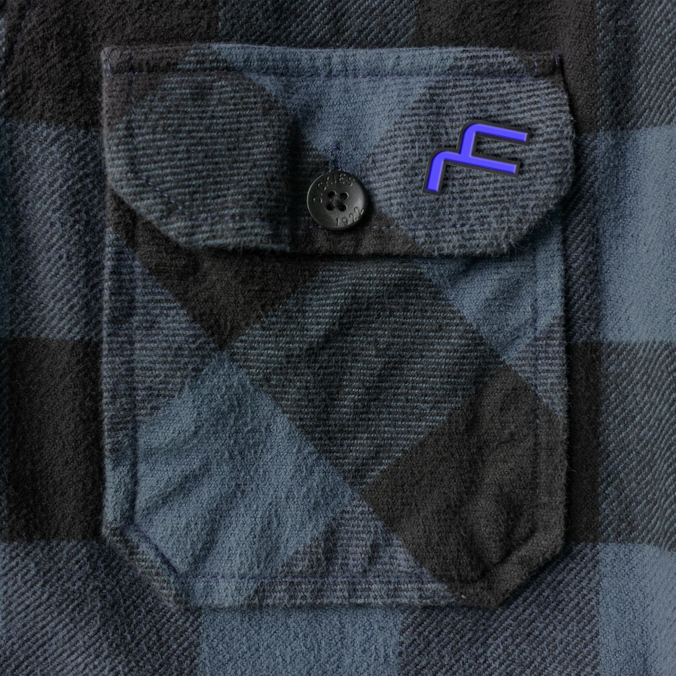
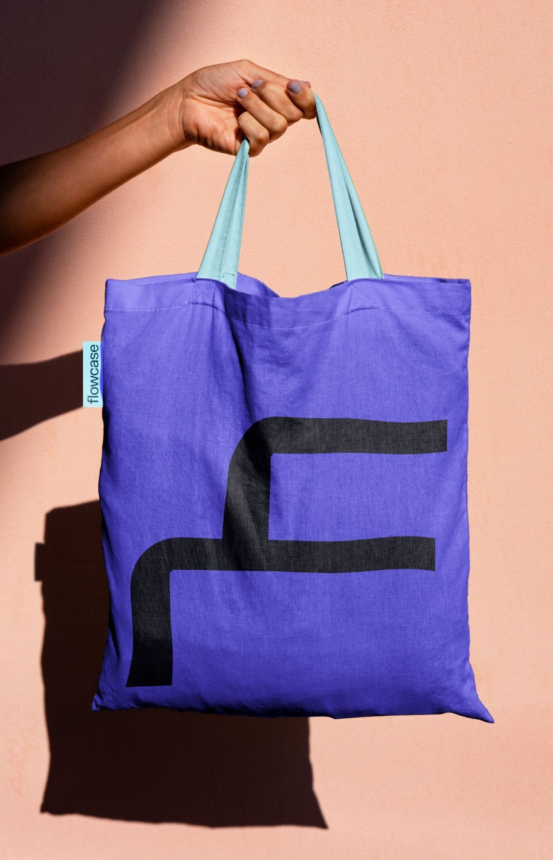
We were approached by CVpartner, an Oslo-based SaaS company, with a new name and a clear focus on expanding into the US market. The name combined the concepts of “flow of information” and “case study,” and we crafted a rebrand that blended Nordic design minimalism with a visual language suited to the US product design landscape. The distinctive “F”-shaped symbol, resembling a briefcase handle, was not only relevant to the target audience but also unique and perfectly compatible with the existing product stack.
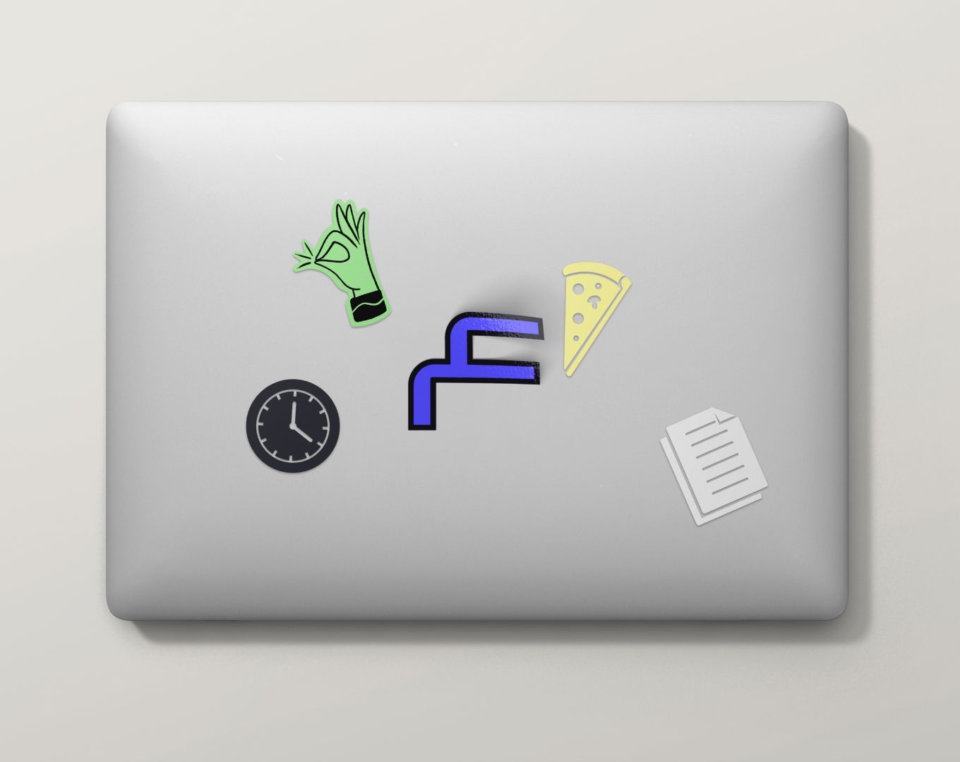
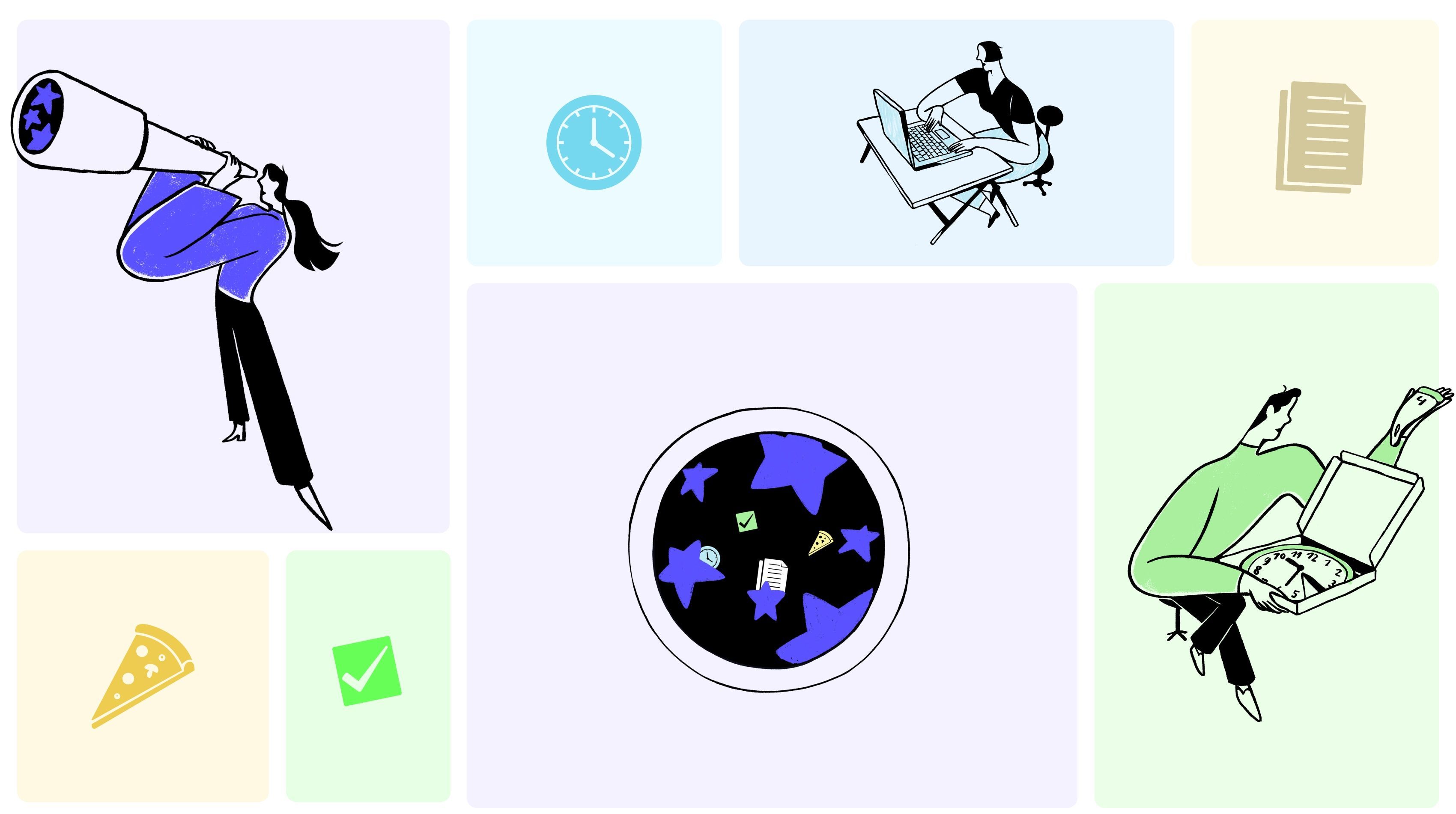
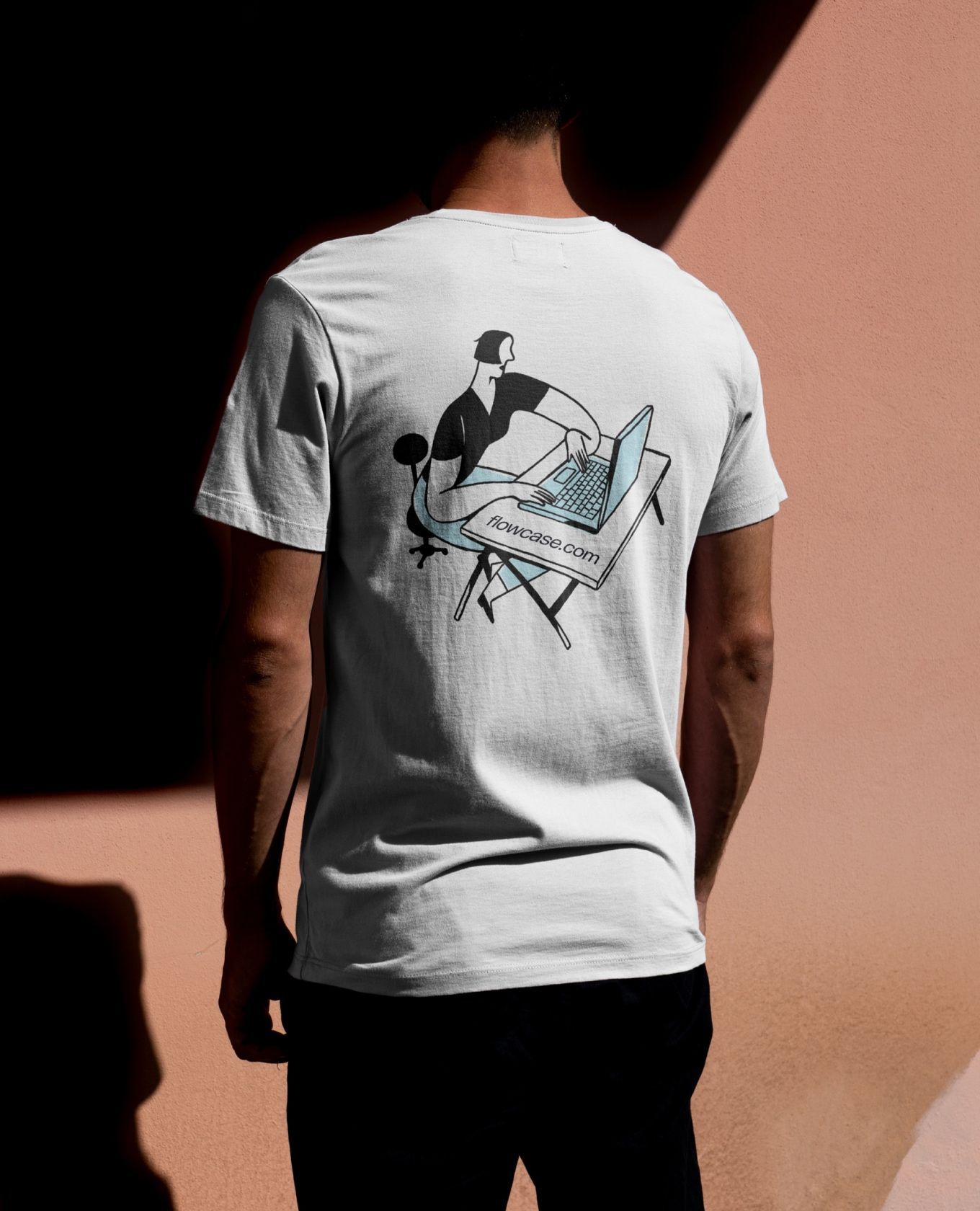
Proposals shouldn’t eat up your time, so naturally, we knew a pizza slice had to make an appearance to capture that mindset. We teamed up with our friends at Niceshit, a Barcelona-based animation studio, to craft a peculiar illustration style that played on visual metaphors—pizza included—alongside business icons.
With the preliminary website and product design updates in place, Flowcase was ready to take its brand system to new heights. Welcome to the world, Flowcase—a bespoke brand suit made just for you.
- Brand Guidelines
- Brand Extension
- Illustration
- Rebranding
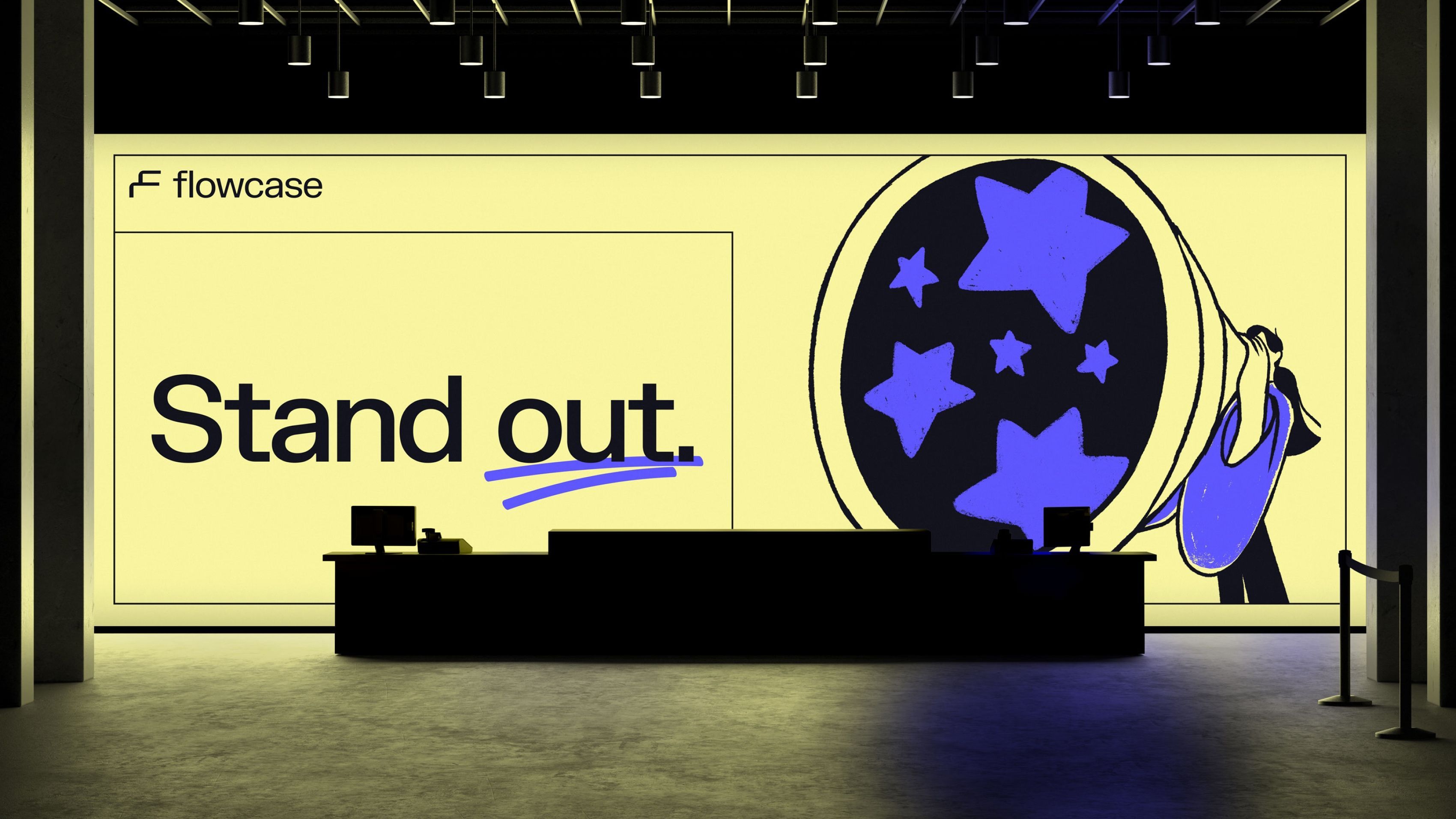
We streamline the full information cycle, and our new name, Flowcase, reflects just that. Stand out!
Rebranding
Merging the concepts of “flow of information” and “case study” led us to explore the idea of stacks. The SaaS product itself revolved around stacks—whether resume stacks or the modular UI represented as card stacks. Rather than pushing for pure originality, we focused on crafting a symbol that was deeply relevant to the product.
During our creative exploration, we drew inspiration from stack shapes that resonated with Flowcase’s brand universe. This led us to craft a symbol that merges an “F” with a sleek, quirky design, standing out in a sea of “F” logos. The result? A distinctive mark that captures the flow of information and embodies the product’s core identity. And let’s not forget those light blue socks—subtle, but they pop 👀.
While we could claim this was the result of ten design thinking sessions, the truth is, it was our first idea that came together seamlessly. It was love at first sight, and from there, everything just stacked effortlessly.
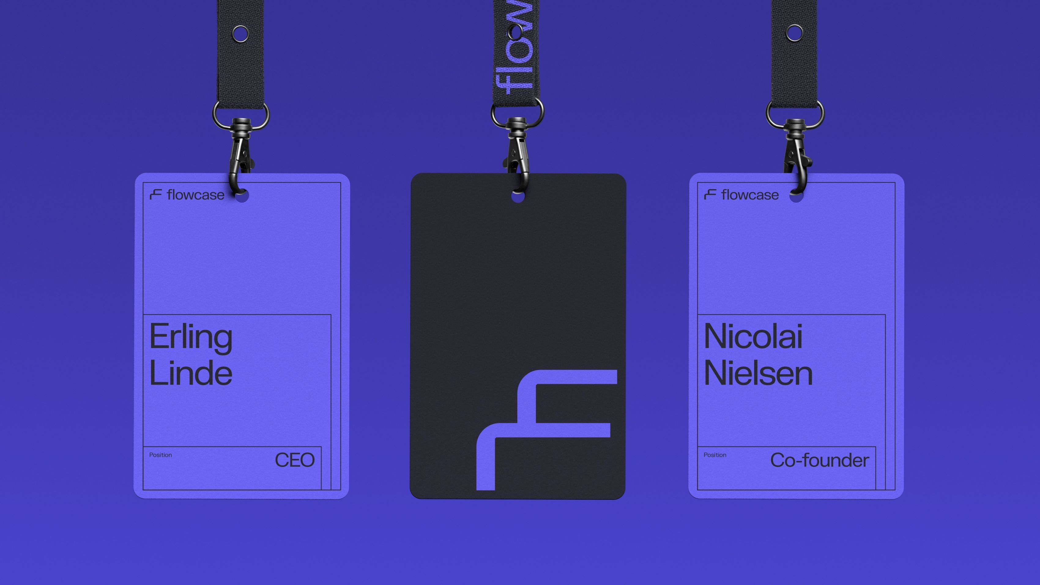
Brand System
The brand system draws from stacks, evolving from simple 2D to a dynamic 3D system that enriches the visual language, perfect for a potential product video.
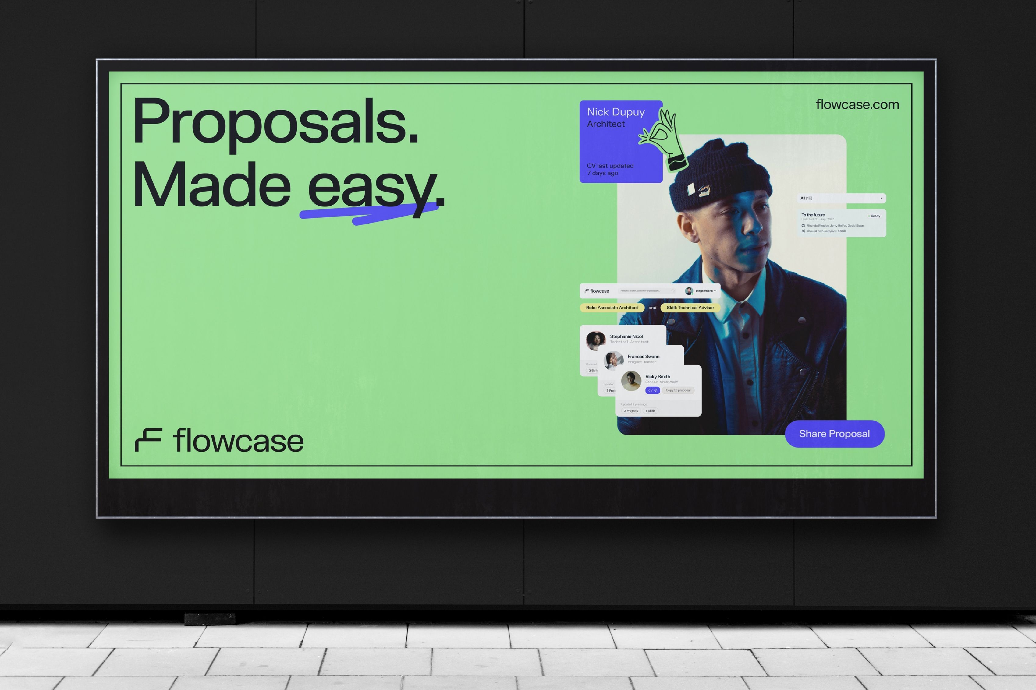
We integrated 3D elements into motion graphics, creating a tangible connection on platforms like social media. By pairing product snippets with floating people photography, users can instantly relate to the brand and get to know the product firsthand.
From website headers to lanyard cards, the system presents content in diverse, impactful ways—particularly through product UI/UX snippets used in print, essential for both the marketing and product teams in launching the new version.
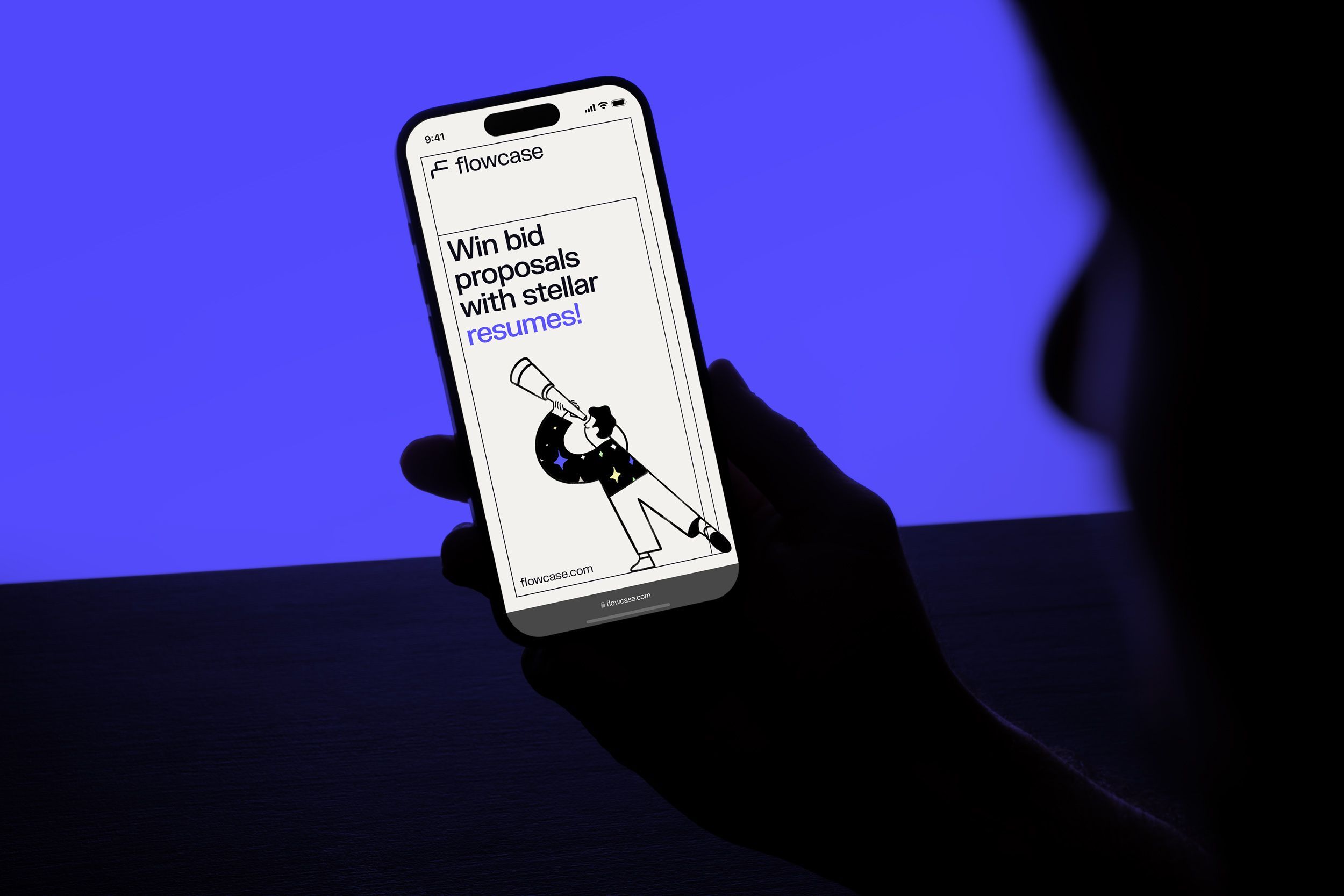
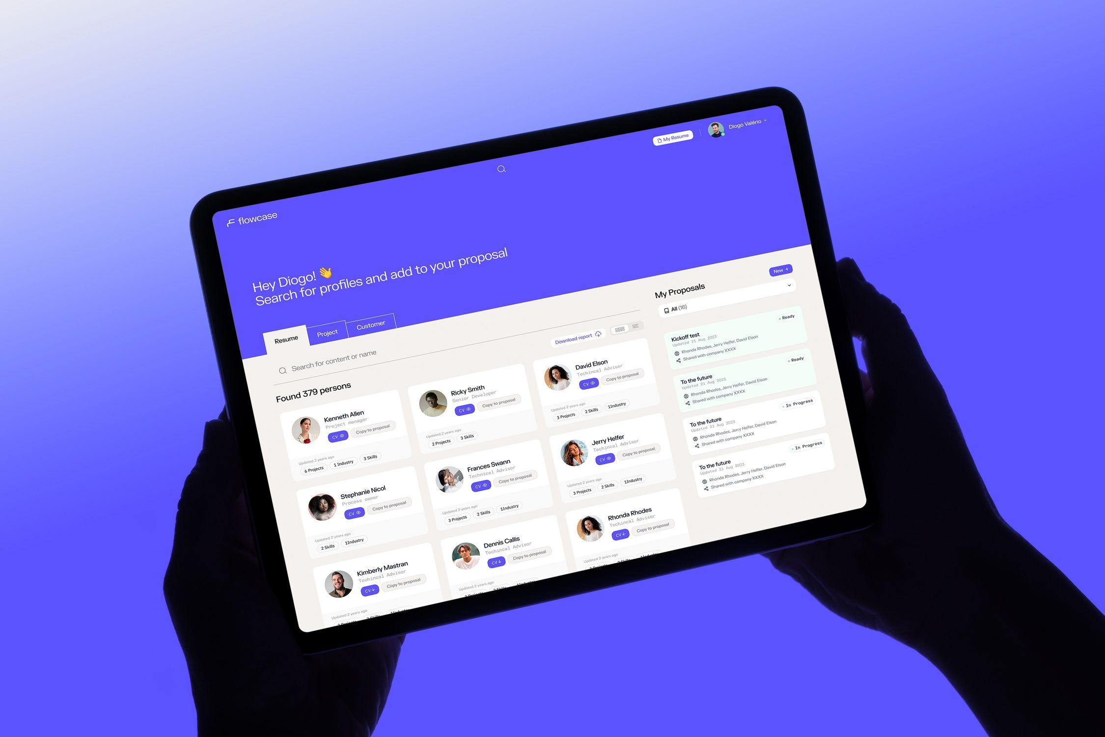
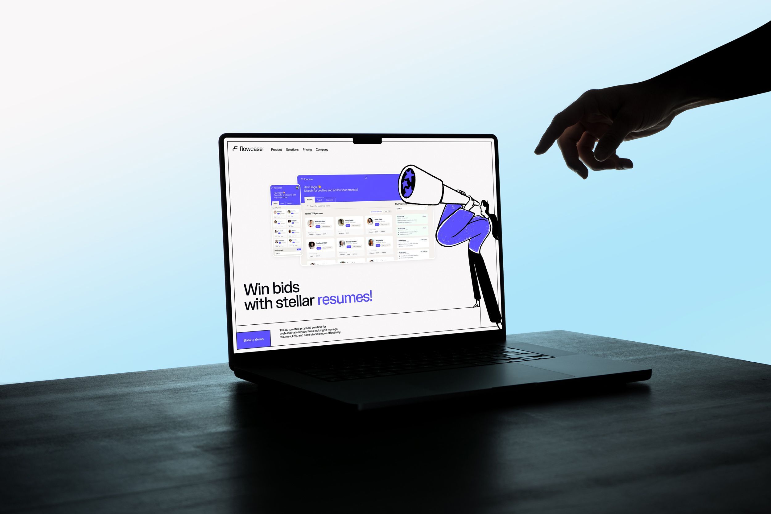
Stack Layout
The design system’s hero centers on real users—the individuals who will interact with the system. Designed to shine with strong motion graphics for the product video, the final stack system of the product UI/UX has been revitalized through the rebranding process. It incorporates elements that accompany the true heroes of the story: the people who use Flowcase daily, streamlining their processes and freeing up extra time for that pizza slice. After all proposals shouldn't eat up your time, but there's always room for pizza right?
This social networks language can also be used effectively on print as an alternative to the illustrations.
Illustration
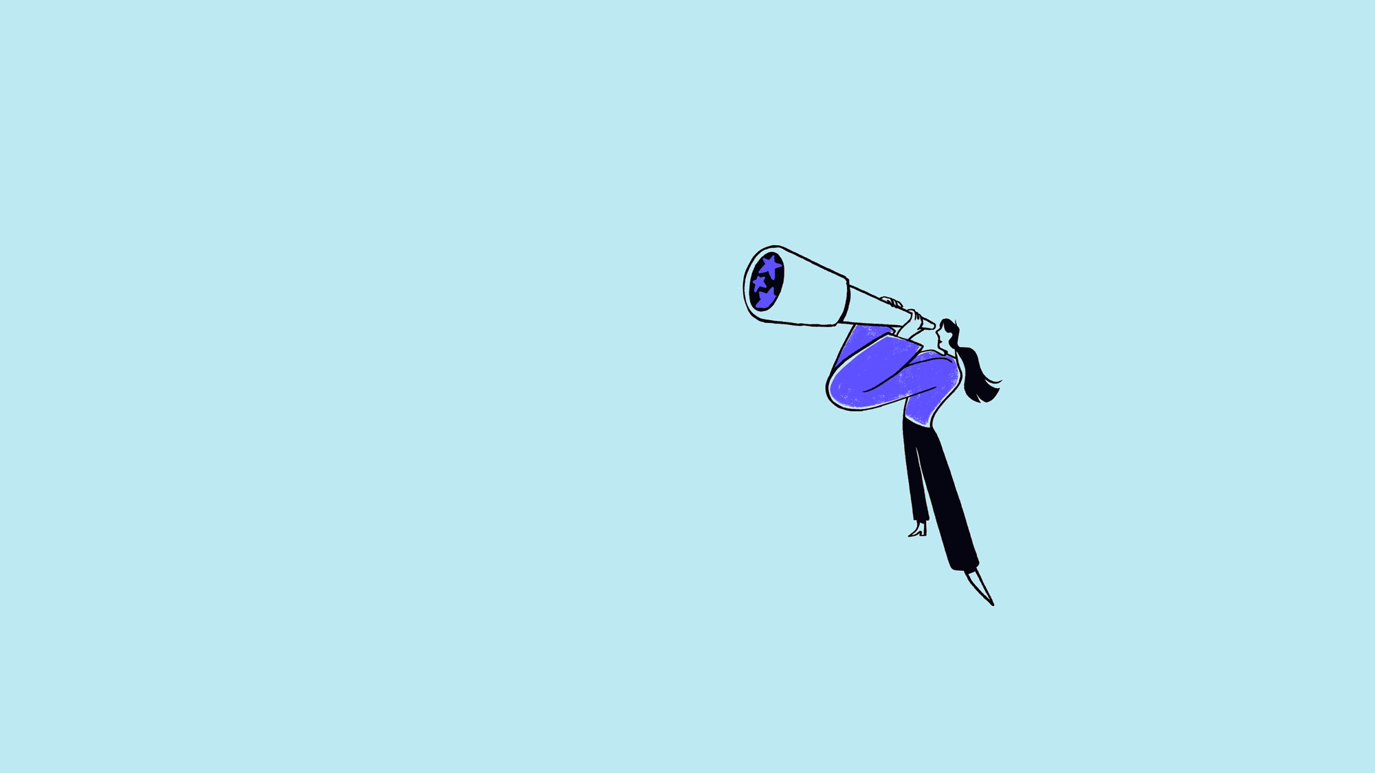
Both dimensions are enriched with contextual illustrations crafted by our talented friends at Niceshit!—definitely worth checking out. The illustration style adds a dynamic, slightly rough edge, with proportions that feel realistic yet exaggerated, giving the business aesthetic a fresh, non-naive vibe. Textures lend a hand-drawn quality, effectively highlighting key words in taglines.
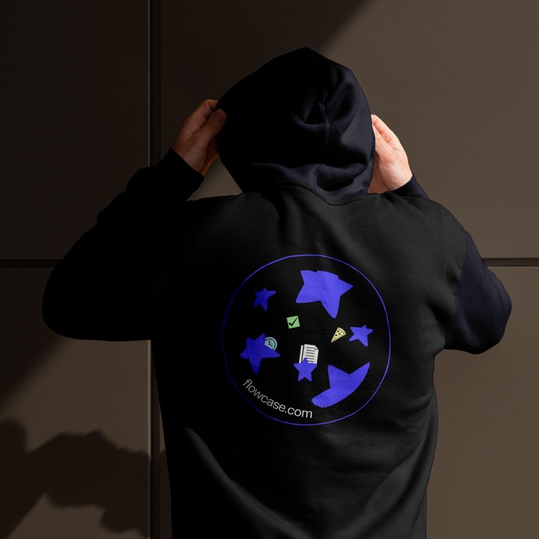
To further enhance relevance in the HR process, we created a series of office-themed vector icons—like a clock, paper stack, pizza (naturally), and stars to highlight stellar bids. These icons are seamlessly woven into the website narrative, reinforcing the message—100% sleek! Nice 💩 indeed!
We partnered with Büro to craft our brand profile and guidelines, and they surpassed our expectations. Their ability to think creatively and design with a unique perspective truly set them apart. Although we ultimately pursued a different direction for our website to better suit our audience, highly recommend Büro for anyone looking for bold, creative design that sets their brand apart.