One wallet for all needs.
Jeton is a new-generation eWallet designed to simplify the way you pay online and offline: Your money, your way.
Jeton is making money more approachable, enjoyable, and easy to use. Here’s how we elevated it.
London, I heard you like tea. Smashing, grab a chair. A jeton was historically a small token used in Europe from the Middle Ages to the 19th century for counting and accounting. Today, it's used in digital finance, referring to tokens or coins in cryptocurrencies or blockchain. Jeton.com makes international money transfers and exchanges effortless allowing to securely send and receive funds. One app for all needs.
The rebranding extended that coin idea by using the disk-shaped element as a ubiquitous metaphor for money and payments, always in motion because money never stands still even if you wish it differently.
This simple yet distinctive element was incorporated into the custom typeface wordmark, utilizing the “O” counter, and extended into a 3D brand universe through various animations. With repetition embraced as a brand hero, it adds a dynamic touch to the new app and website, giving them a mint, tech-forward feel—what’s not to like?
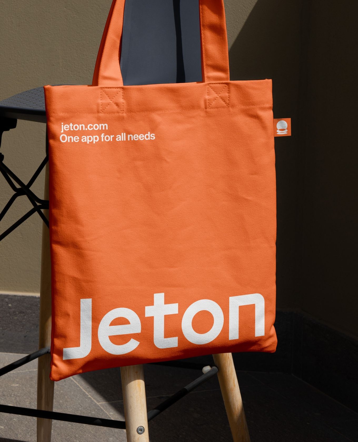
We had to work with orange as a non-negotiable, so we went all in with a deep burnt orange for everything, from typography to backgrounds. The added 3D color subdued pastel ranges introduced a counterpoint of warmth and calmness to the overall design. For the first time in our history, we almost didn’t use black in the website's CSS.
Contrast checkers evangelists, rise up!
- 3D
- App Design
- Brand Guidelines
- Digital Design
- Rebranding
- UI/UX
Rebranding
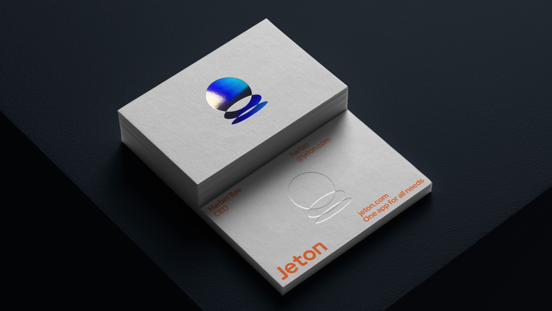
With the "O" naturally suggesting a coin shape, the rebranding was anchored by a sturdy wordmark featuring subtle typographic nuances that ensure Jeton's identity. A blend of soft and clean geometric angles across all glyphs and icons guarantees coherence, while the brand symbol mimics the motion of coins within a single snapshot, seamlessly merging form and intended function (i.e., money flowing Y'all).
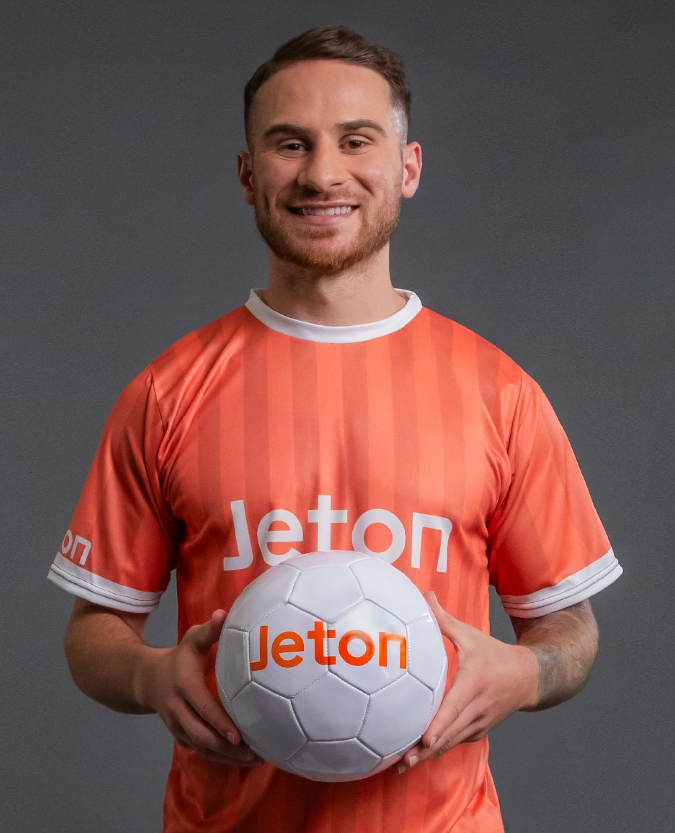
The brand was designed for high-impact minimal applications, ensuring readability even on sports uniforms, as Jeton proudly stands as an Official Partner of West Ham United F.C. and Legia Warsaw. Targeted toward a younger demographic, the vibrant orange-and-white color combination provides the brand with a much-desired youthful appeal.

3D brand universe
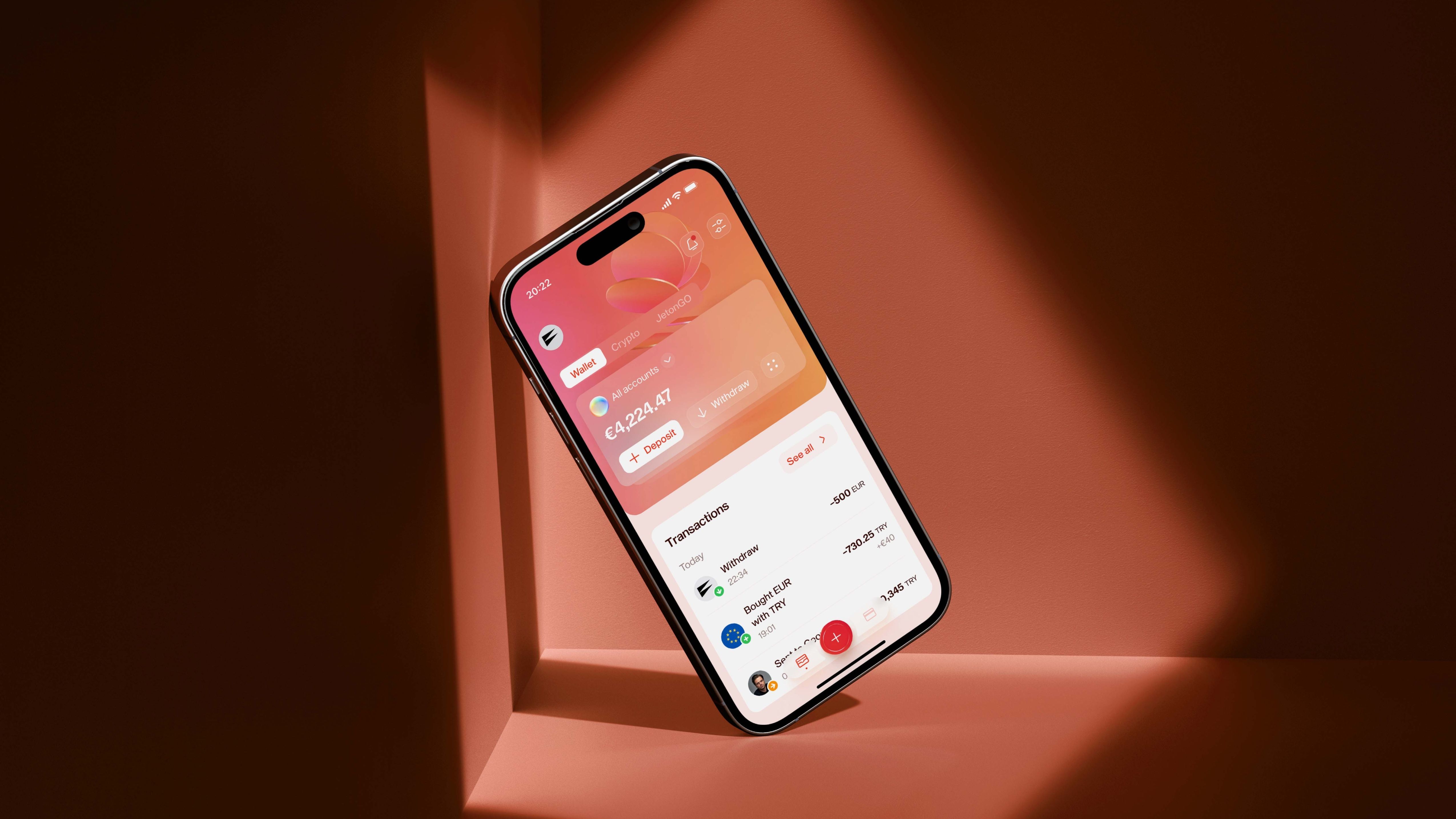
Jeton's brand universe was built on two key elements: the app UI/UX designed to facilitate smooth transactions and a 3D realm featuring coin-shaped metaphors that abstractly represent the essence of money transactions.
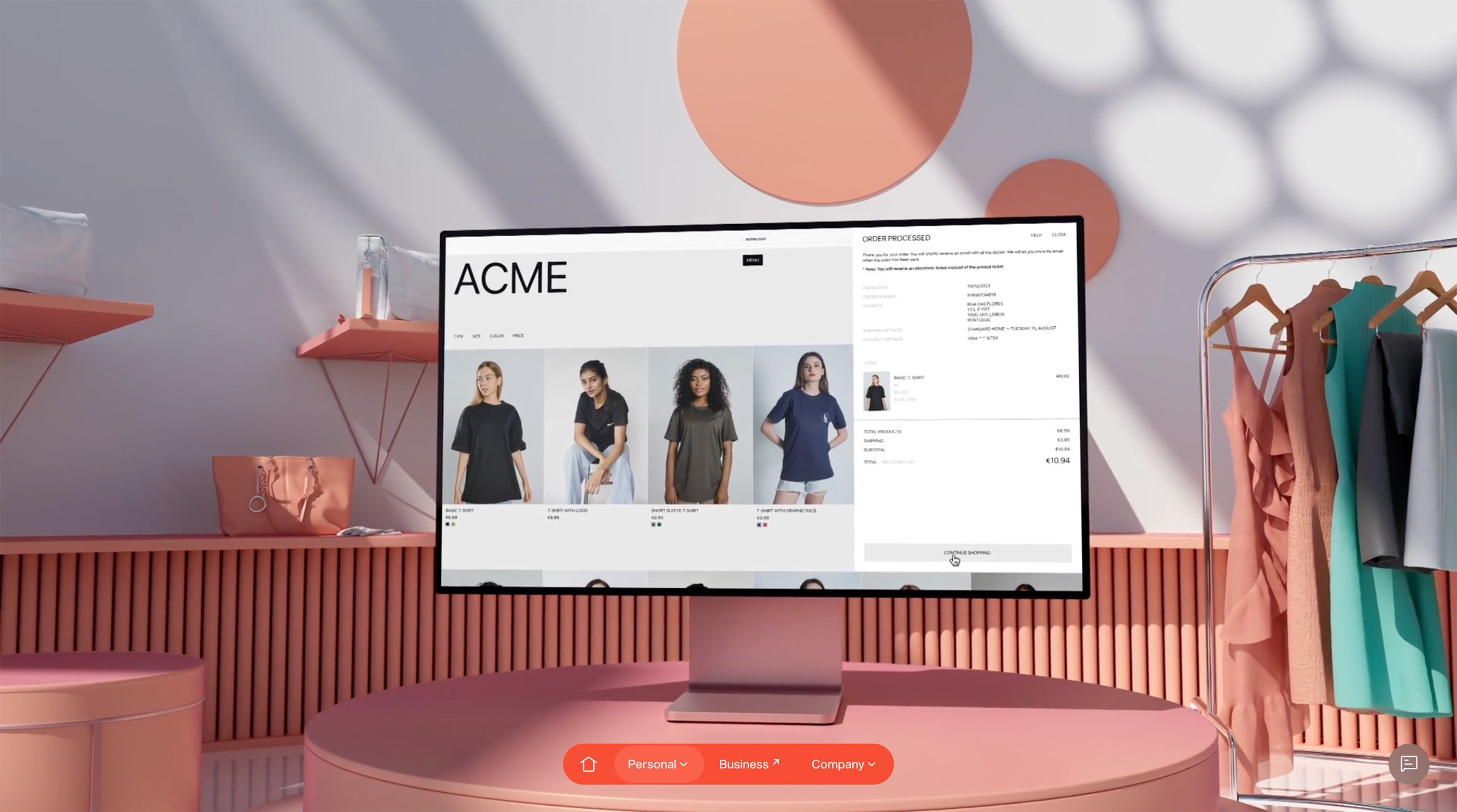
The 3D brand assets followed two pathways: the main abstract headers and real-use case store scenarios that integrate the payment flow. Both are essential for engaging users and enhancing the product's storyscrolling.
Website
One million users and counting—plus you! That's the true scale of Jeton's audience, and it's just the beginning.
Contactless payments? Sure. Spending limits? Check. Card freezing? Also check.
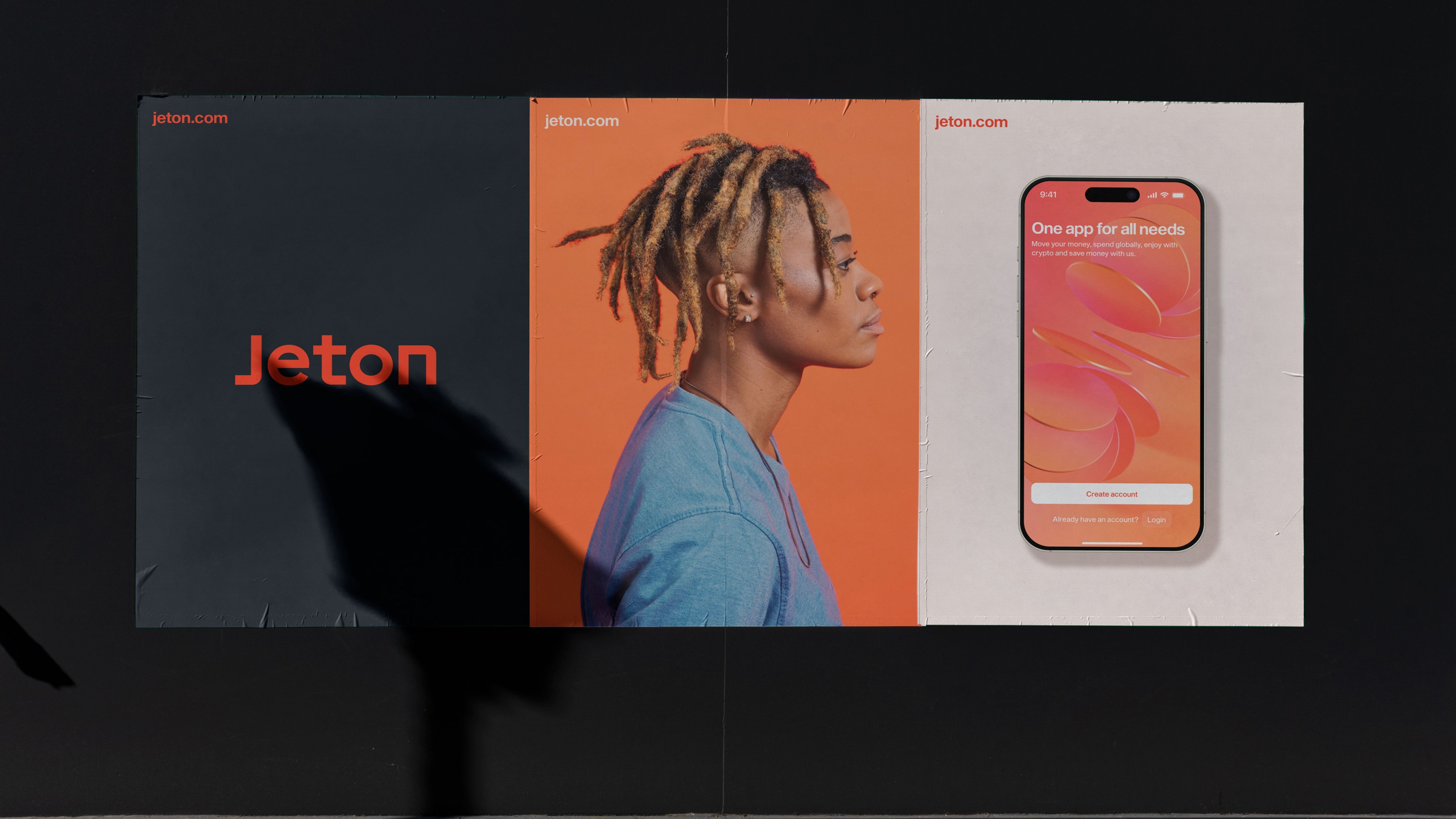
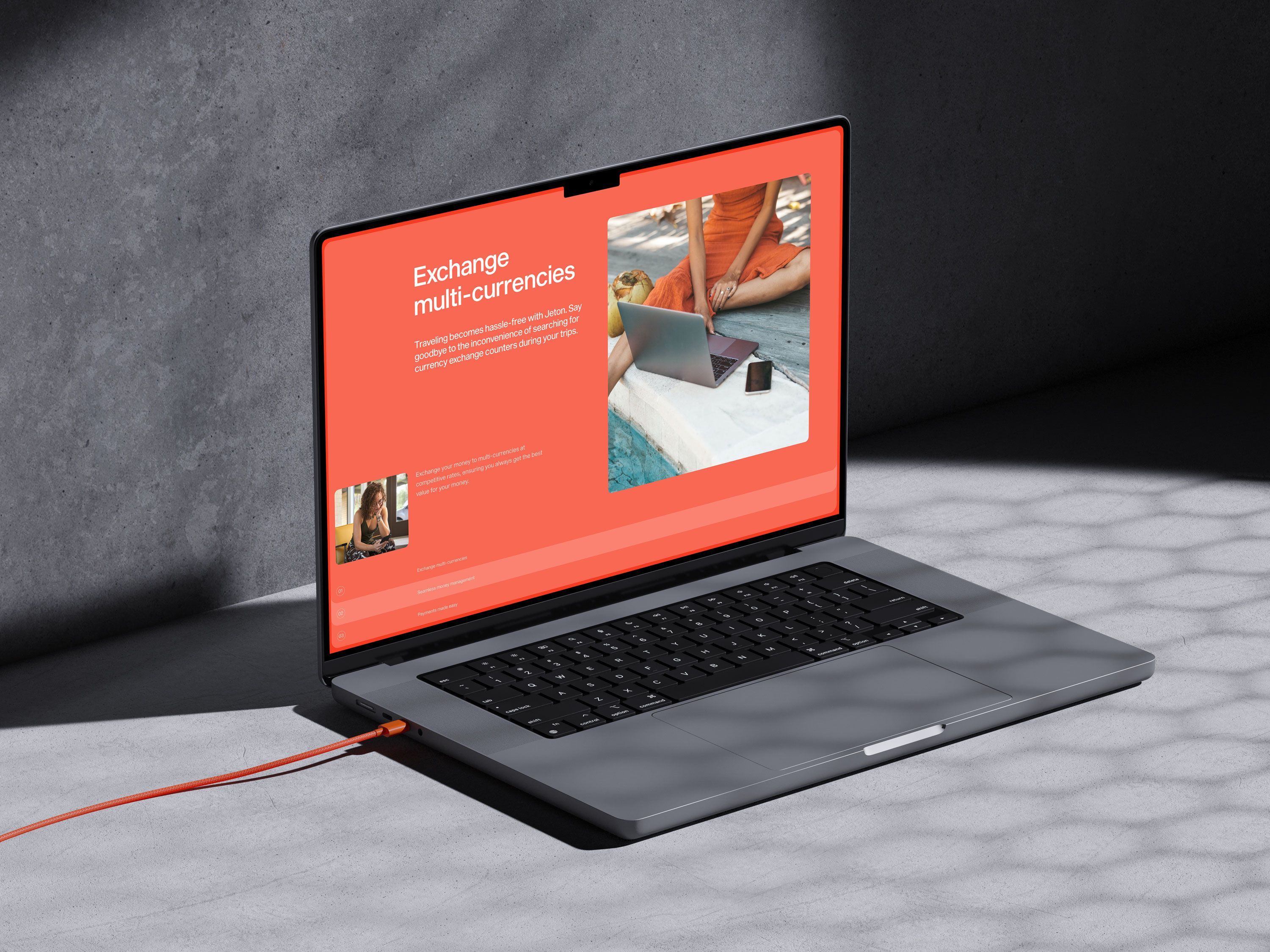
The website narrative revolves around unifying all finances: one app for all needs. As users scroll, they effortlessly discover all the features and functionalities available, with minimal interaction required and without overwhelming autoplay animations. Striking this balance is a challenge, but the result is a beautifully streamlined experience (emotional scroll ahead!).
If you're familiar with our scrolling experiences, you know we love to experiment with our design system—especially with tabs! This time, we had a blast incorporating flags within a circular shape. No special instructions are needed; just use your mouse and explore! Don't forget to check out the fiat conversion calculator—let's make our analytics matter!
App & Web App
There's always a point on the rebranding process that you have to carry the bad news to the product manager: "The brand looks great, right? But the product needs come UI/UX polishing so we can use it on the website in all it's glory". Understandably this can press some anger buttons, given that it will affect seriously the product roadmap, but when you have the right people on-board that understand this has to be done, you get extra karma points.
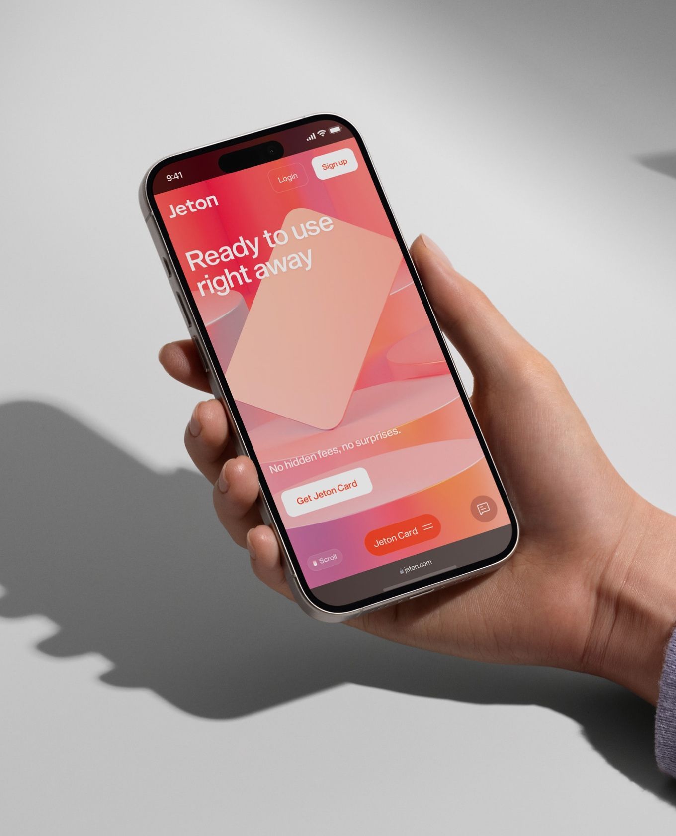
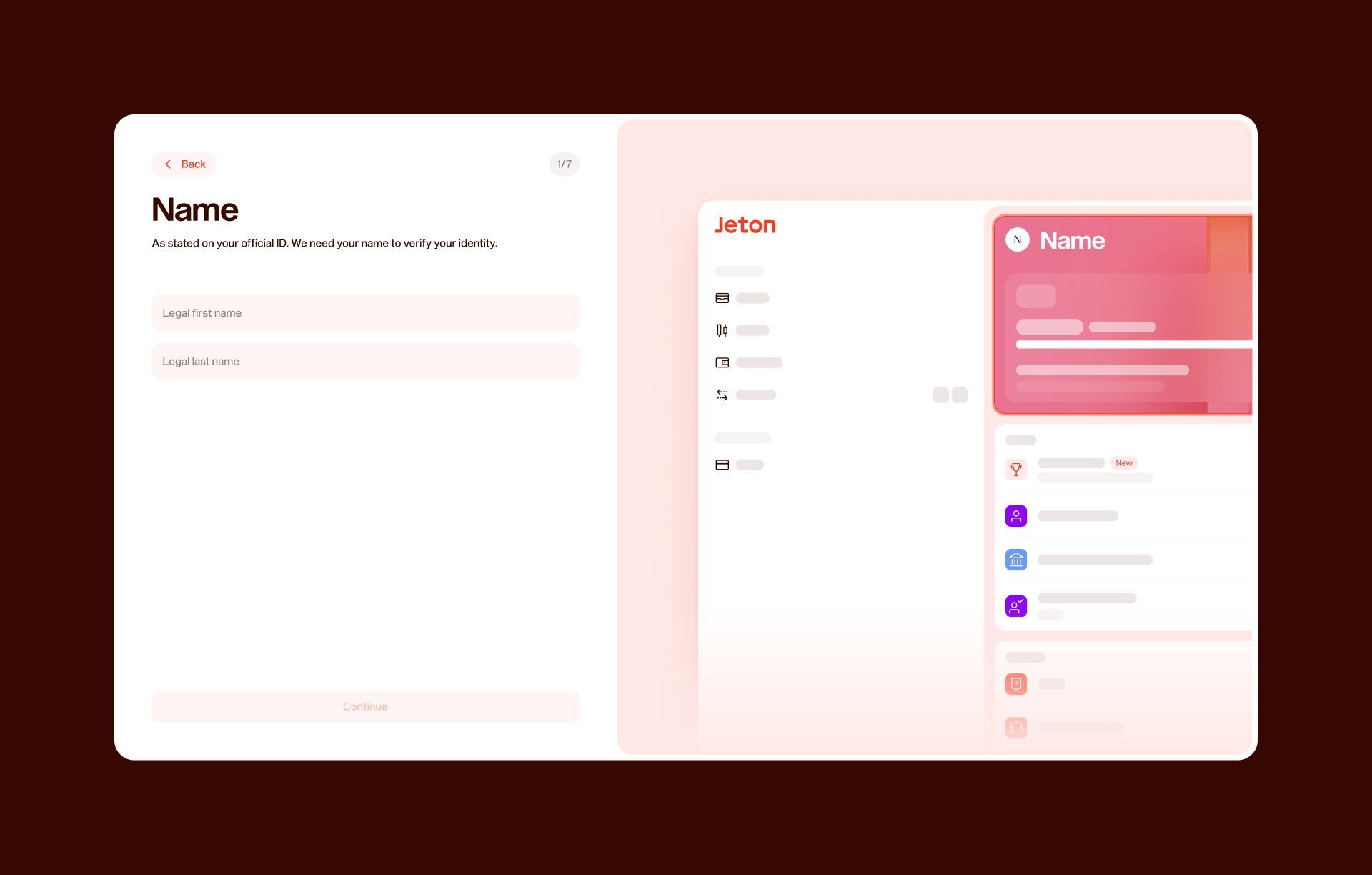
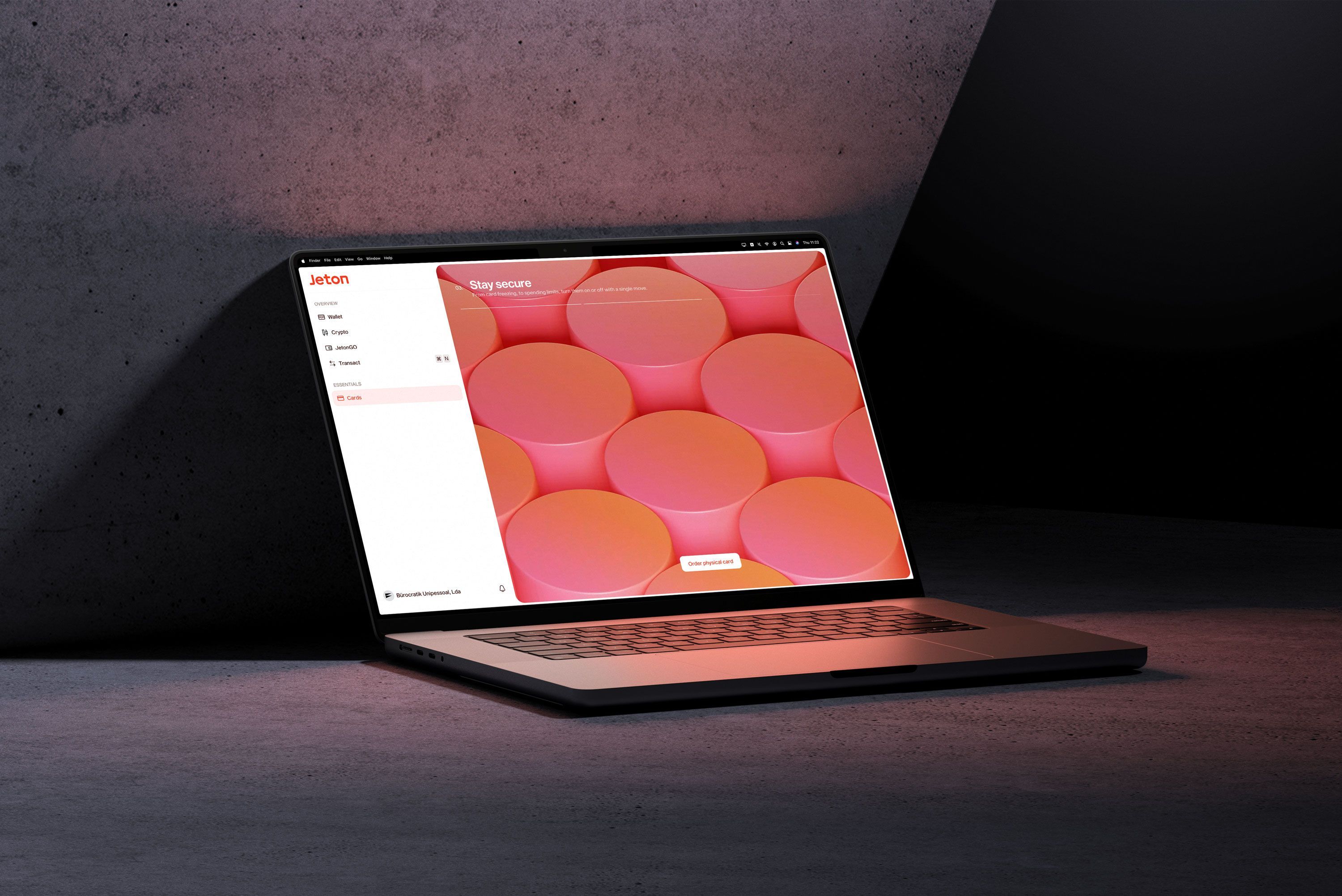
We delivered a fresh design system and brand universe for Jeton's app and web applications, ensuring that the website hero accurately reflects the app experience, eliminating any surprises for users who try it later. Each main section of the app features a custom 3D loop that reinforces actions while steering clear of the sameness that plagues many apps. The coherence of the design system breathes new life into the product.
Jeton's flagship pieces are now complete, ready for their amazing team to evolve even further!
How do you take a product with over a million users and give it a fresh, new feel? Büro did just that, and they made it look easy. From rethinking our brand to revamping our app design, they completely nailed it. Their team was a pleasure to work with, keeping communication clear and the process smooth. We’re proud of the new direction. Thank you, Büro, for a job well done!