Just like a bank, but better.
Speedy is an all-in-one invoice and payments platform that streamlines your business needs in a single, seamless solution.
Speedy (previously Speedyteller) is a fintech payment and invoicing product aimed at LATAM, which allows local companies and people to invoice and be paid online with ease.
Brazil was the first country to launch Speedy, followed by Peru, Colombia, and Argentina. An impressive list of 11 other countries is lined up next, with only a few minor payment and accounting details left to address. In short, Speedy is a local product with global reach—what we proudly call “glocality.”
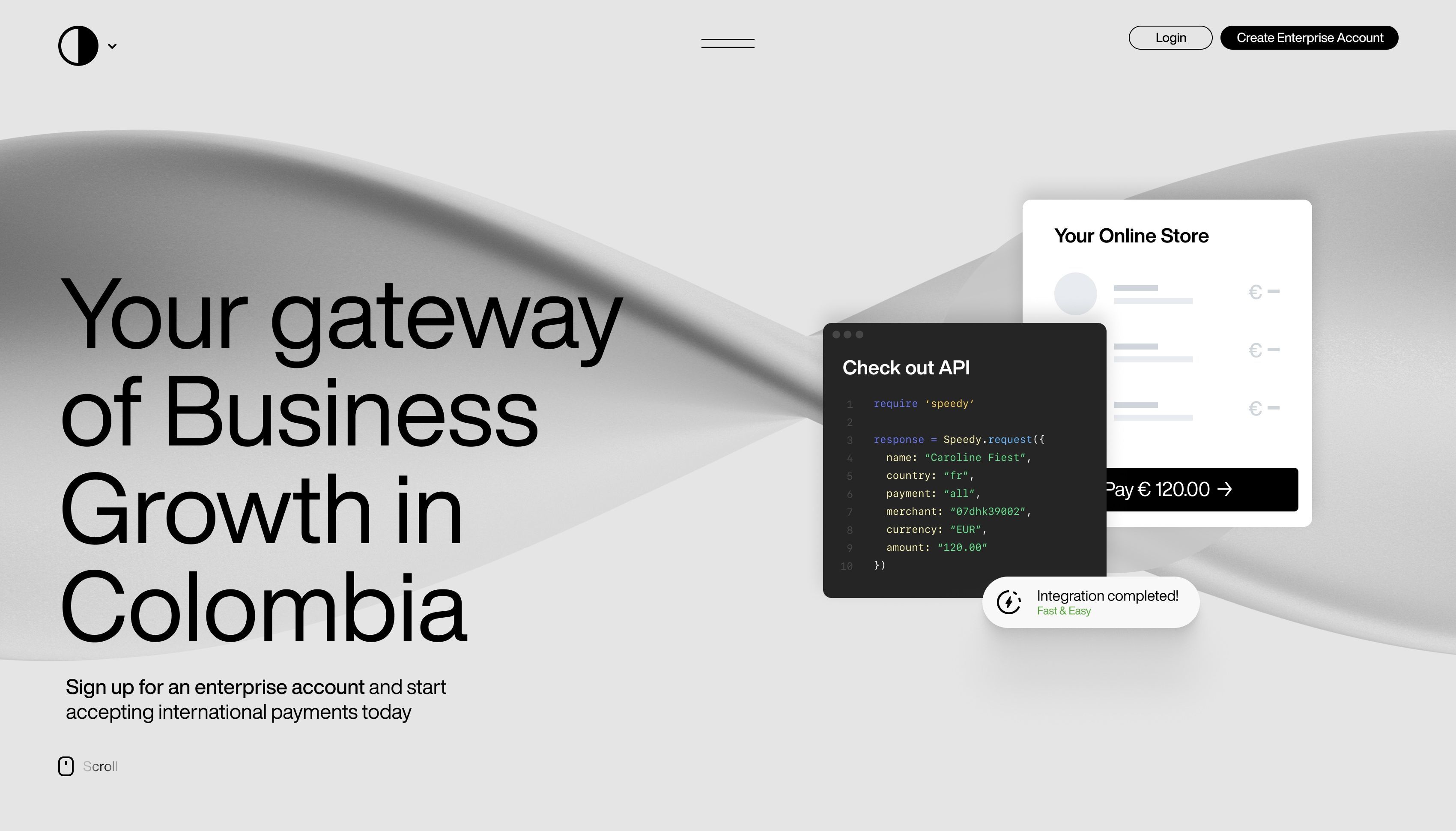
The brand and website concept revolves around a black-and-white 3D globe—a universal visual metaphor for global reach—that adapts its colors based on the country being served. The product is explained through on-scroll micro-animations, with a mobile-first approach to both design and development. Functionalities are presented first, followed by a detailed look at the dashboard interface. To add a personal touch, the footer incorporates a local voice, showcasing common names of Speedy users for each specific country.
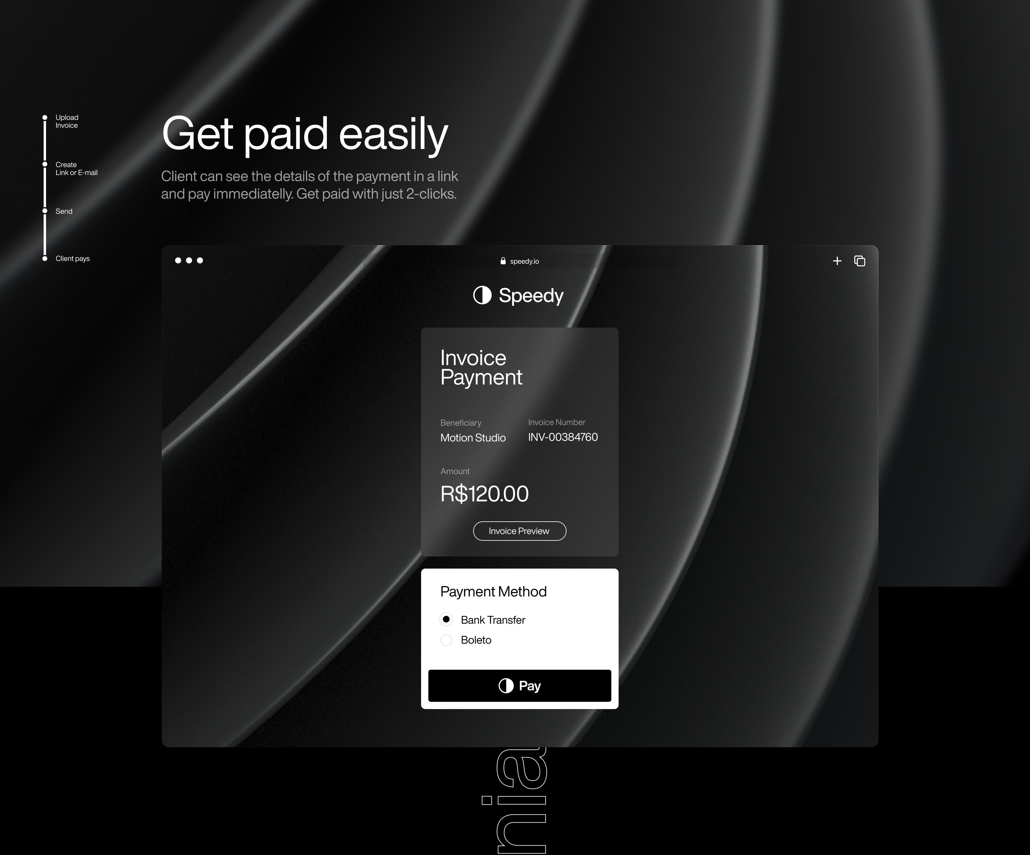
Speedy offers two key solutions: Speedy for the general public and Speedy Enterprise Checkout for seamless website integrations with third-party brands. The website’s primary goal is to maintain a clutter-free design, showcasing a Swiss-inspired typographic aesthetic—clean, minimal, and as straightforward as a payments platform should be, ensuring it’s accessible for virtually anyone to use.
The digital brand applications we designed span across promotional product and brand videos, the website, design system, dashboard, and native apps. Each element is deeply rooted in digital, showcasing a strong, vibrant local character through copy and color. Speedy: Easy and Fast.
- 3D
- App Design
- Branding
- Brand Guidelines
- Naming
Website
The brief called for a minimal black Swiss-style website—no clutter or excess, just clean and straightforward. The goal was to reflect the simplicity and speed of their product, delivering a design that gets straight to the point.
The website concept centers around a black-and-white 3D globe—the standard visual metaphor for global reach—which dynamically changes its colors based on the country it’s serving. Black is used for the overall product presentation, while white is reserved for the professional business account. The product is introduced through an on-scroll experience, enhanced with micro-animations and developed with a mobile-first approach to ensure smooth, intuitive navigation across devices.
The abstract 3D globe plays a pivotal role in illustrating the product’s functionalities, which are introduced first, followed by the dashboard interface. To add a local touch, the footer highlights common names of Speedy users from each country, reinforcing the platform’s global yet personalized character. This seamless blend of global reach with localized details helps create a cohesive experience for users across different regions.
3D
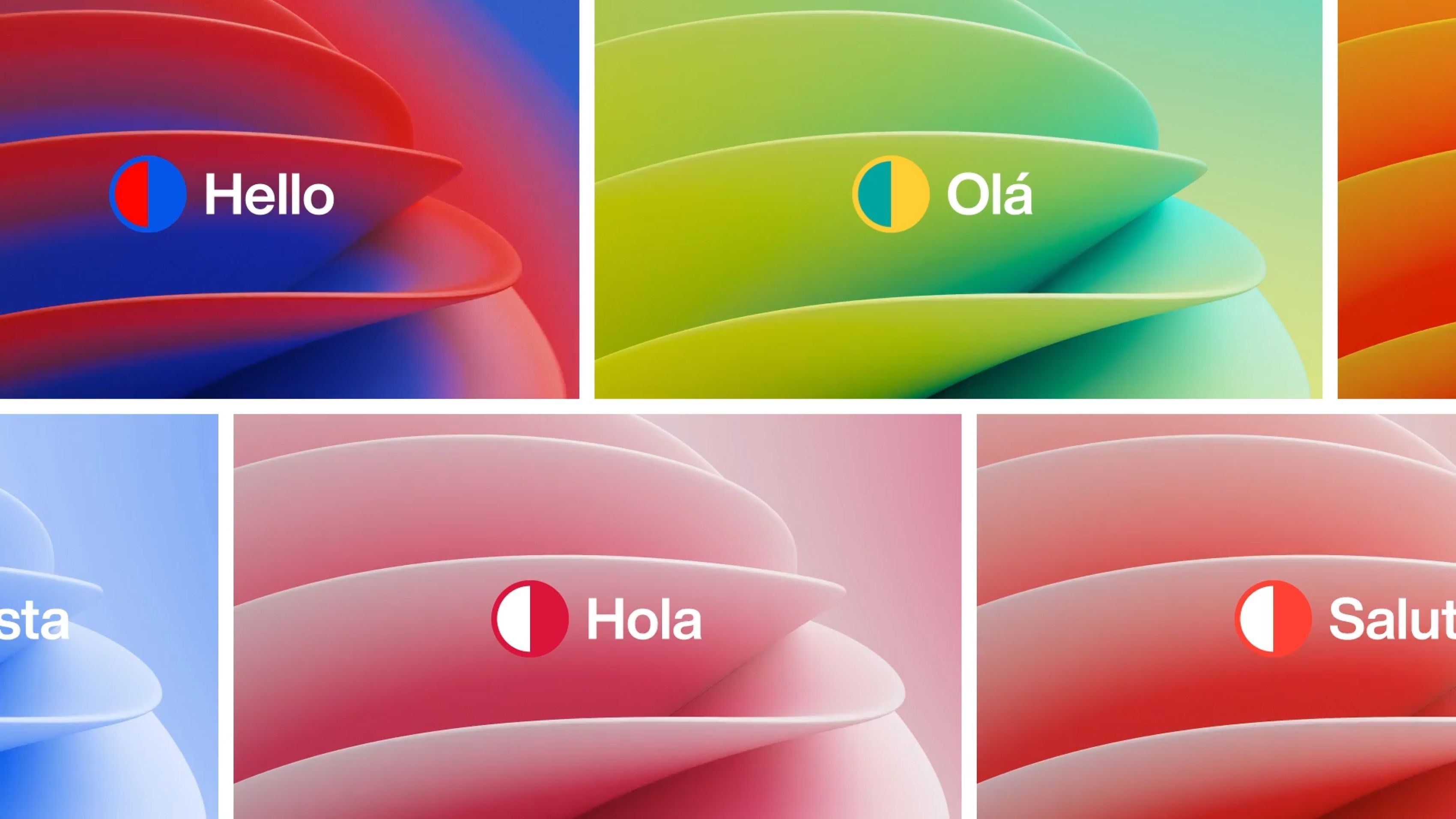
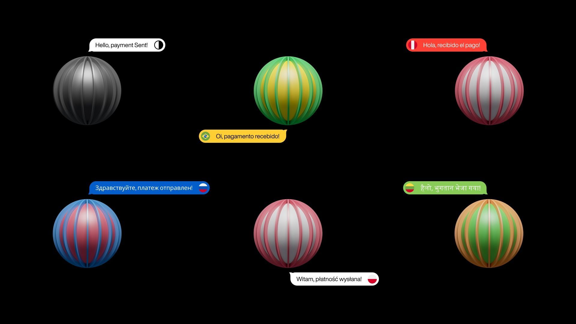
The 3D globe enhances Speedy’s narrative by visually showcasing its global reach, adapting to each country’s local identity through two colors from their national flags. This color shift reflects Speedy’s flexibility and adaptability to various markets, using a dynamic visual metaphor that helps users connect the product’s global presence with its localized service capabilities.
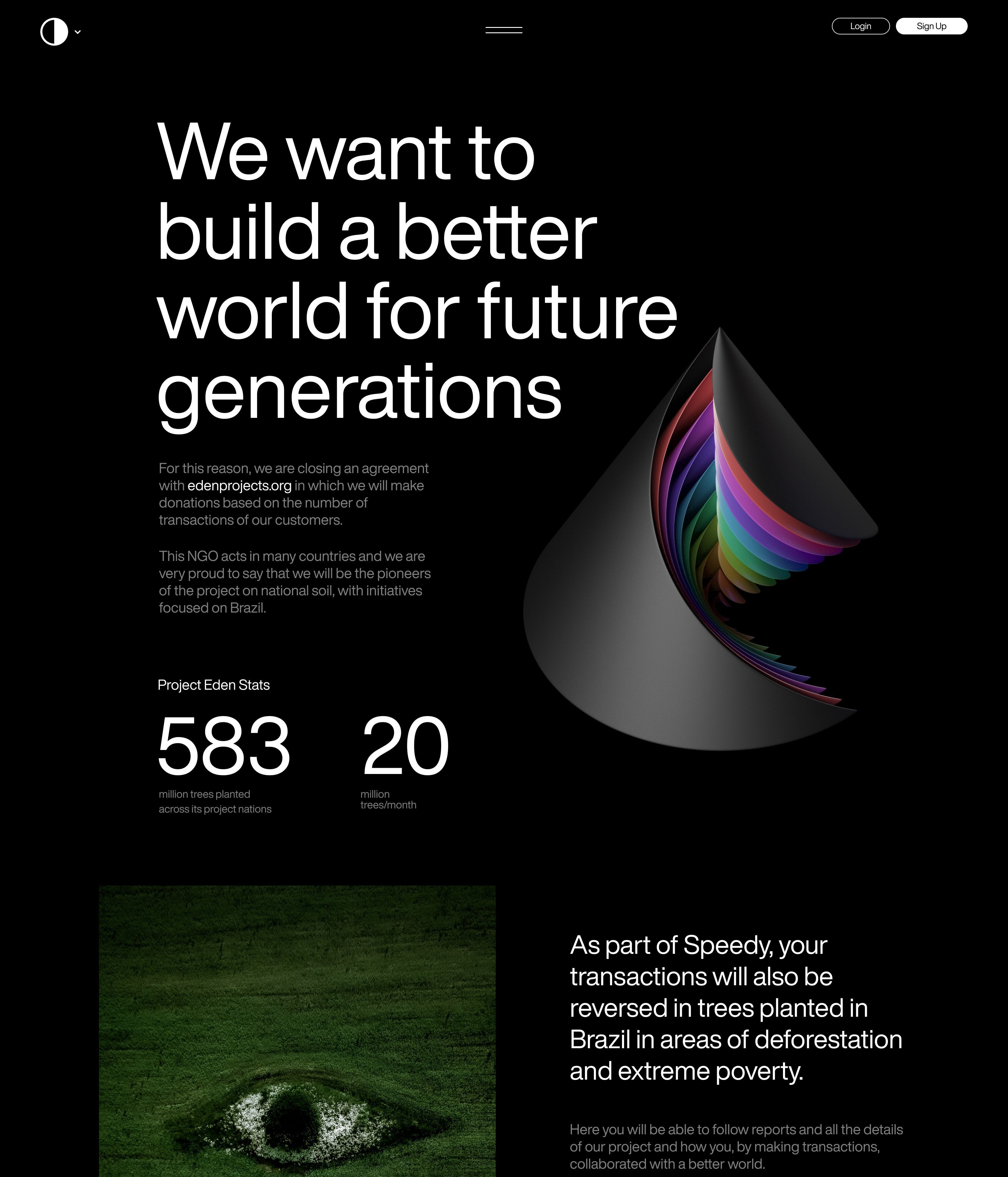
The globe serves as a central, evolving element, tying together Speedy’s core functionalities with its global yet personalized service offering. On the homepage, a 3D tree asset also displays the full range of colors in Speedy’s identity, symbolizing the platform’s diverse and inclusive approach.
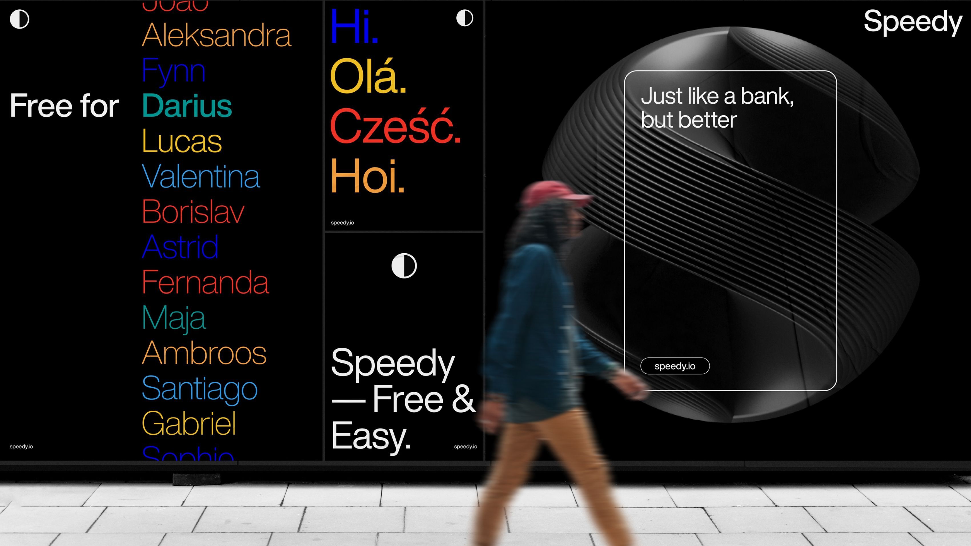
To elevate our commitment to locality, we recorded several terms in over 10 languages, creating a multicultural language lexicon that reflects the true global yet local essence embedded in the brand’s DNA. This was before the advent of AI, so yes, these are real people from real places, with real voices—for a also real, authentic and genuine product.
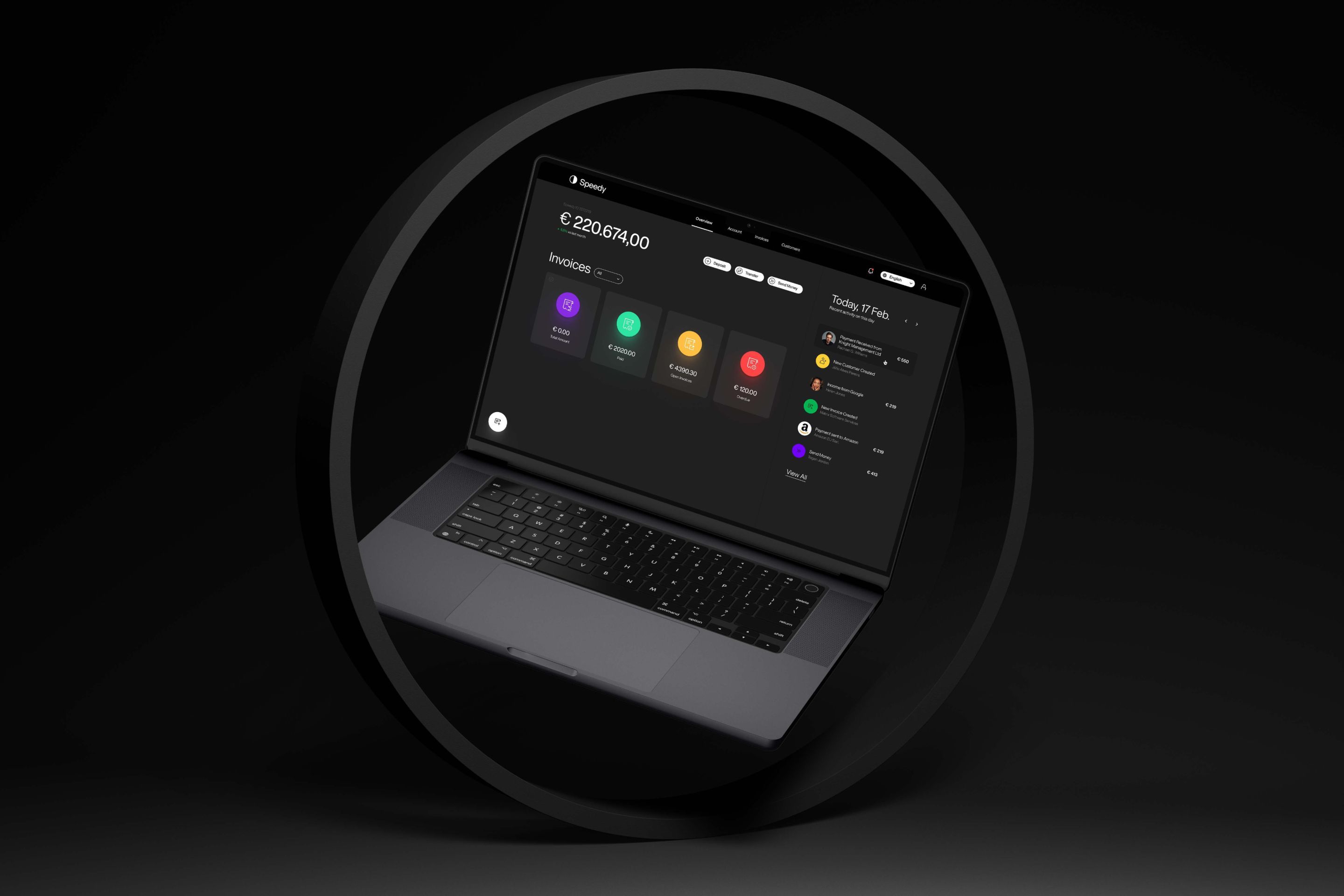
Web portal dashboard
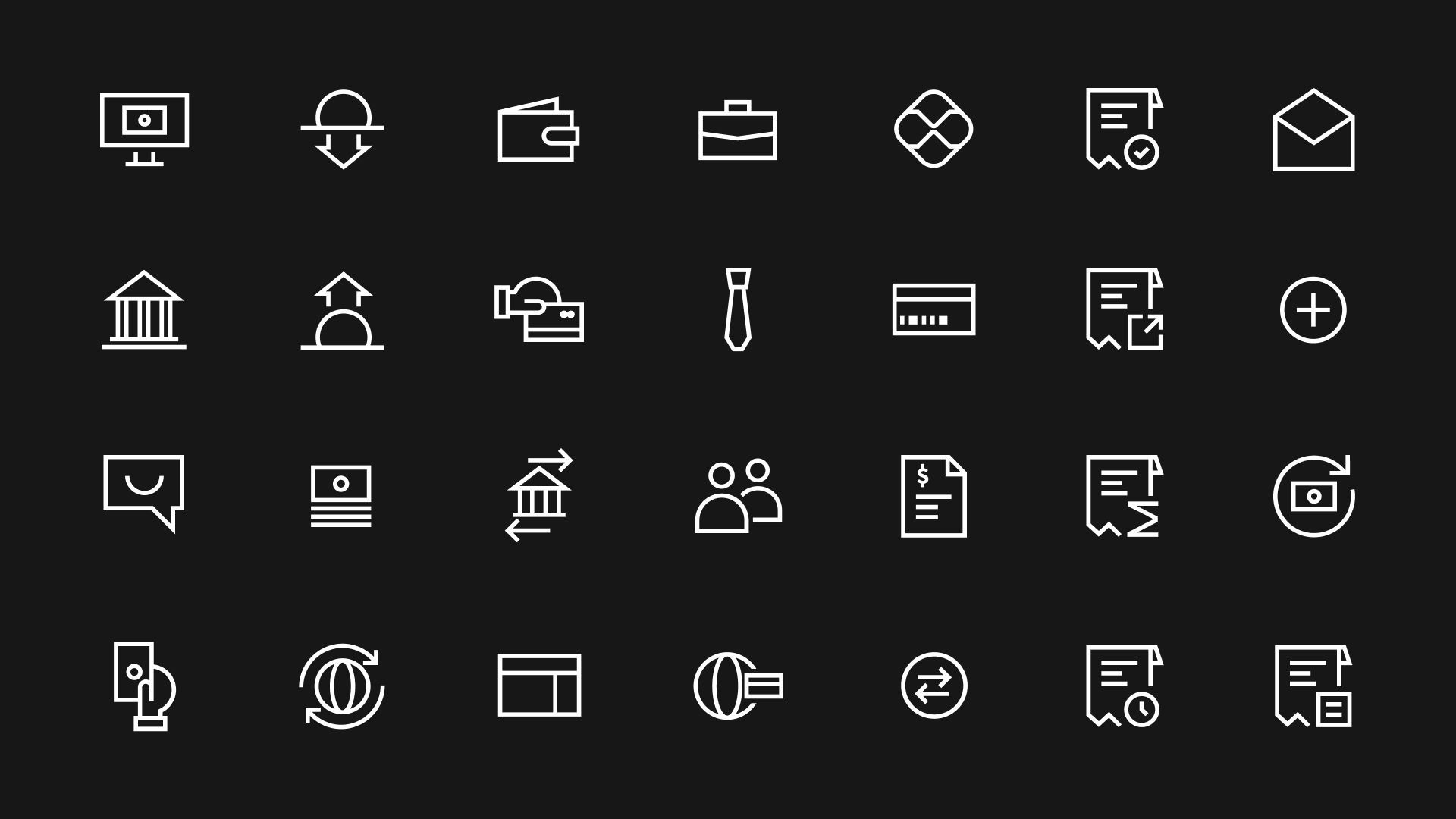
Another important deliverable was the revamp of the product’s UI/UX to align with the new design system. We’ve elevated the product by extending the graphic language to include onboarding materials, brand 3D assets, videos, backgrounds, and wrapping up with an extended family icons. The result is a genuine extension of the brand and website into the most critical component that users will interact with: the web portal dashboard (recently discontinued) and the native iOS and Android apps, which you can explore further below. Go for it!
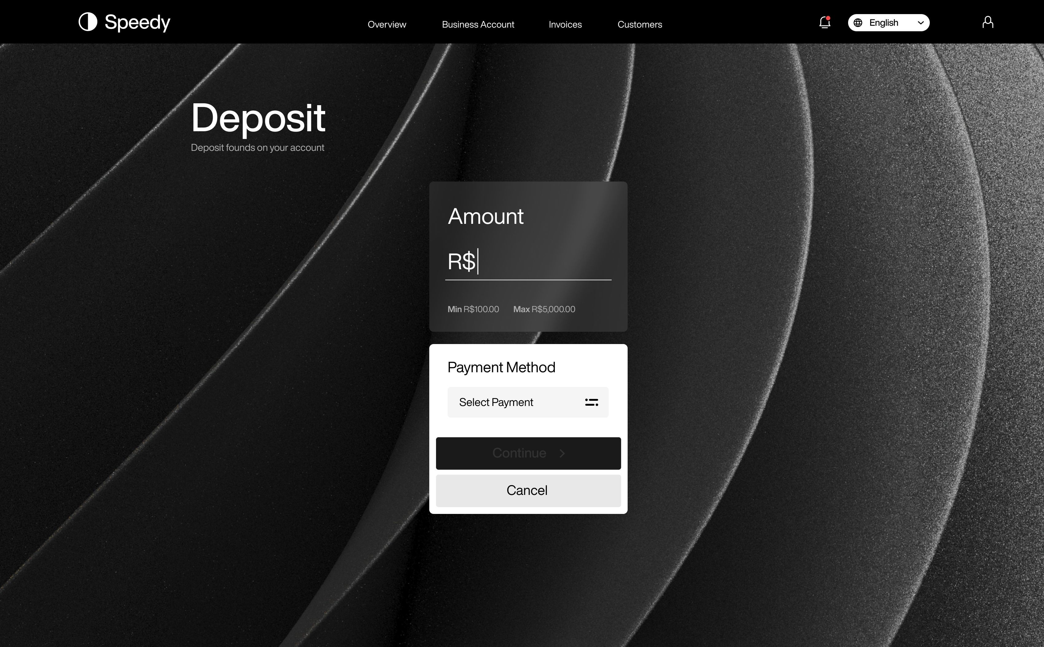
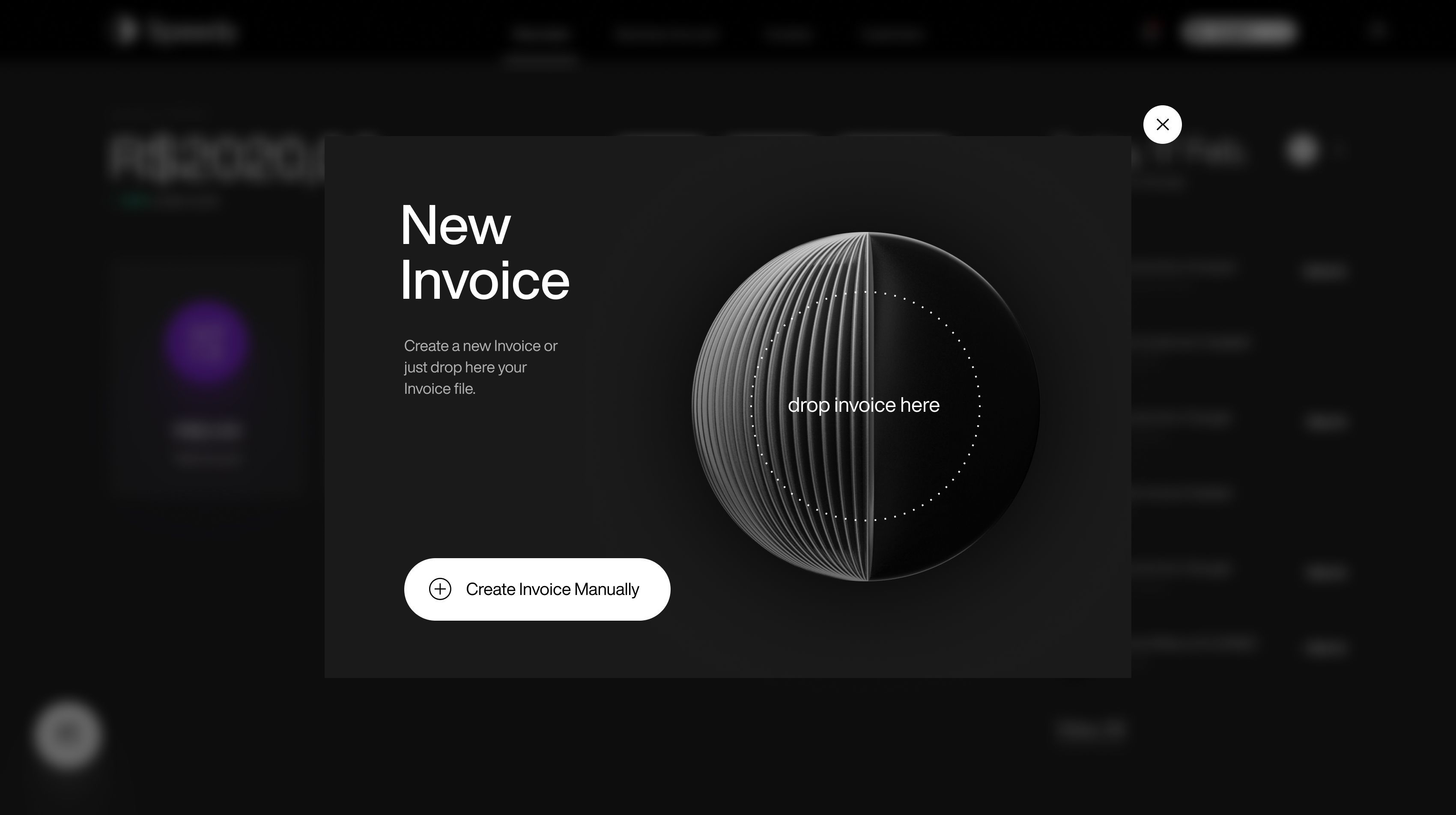
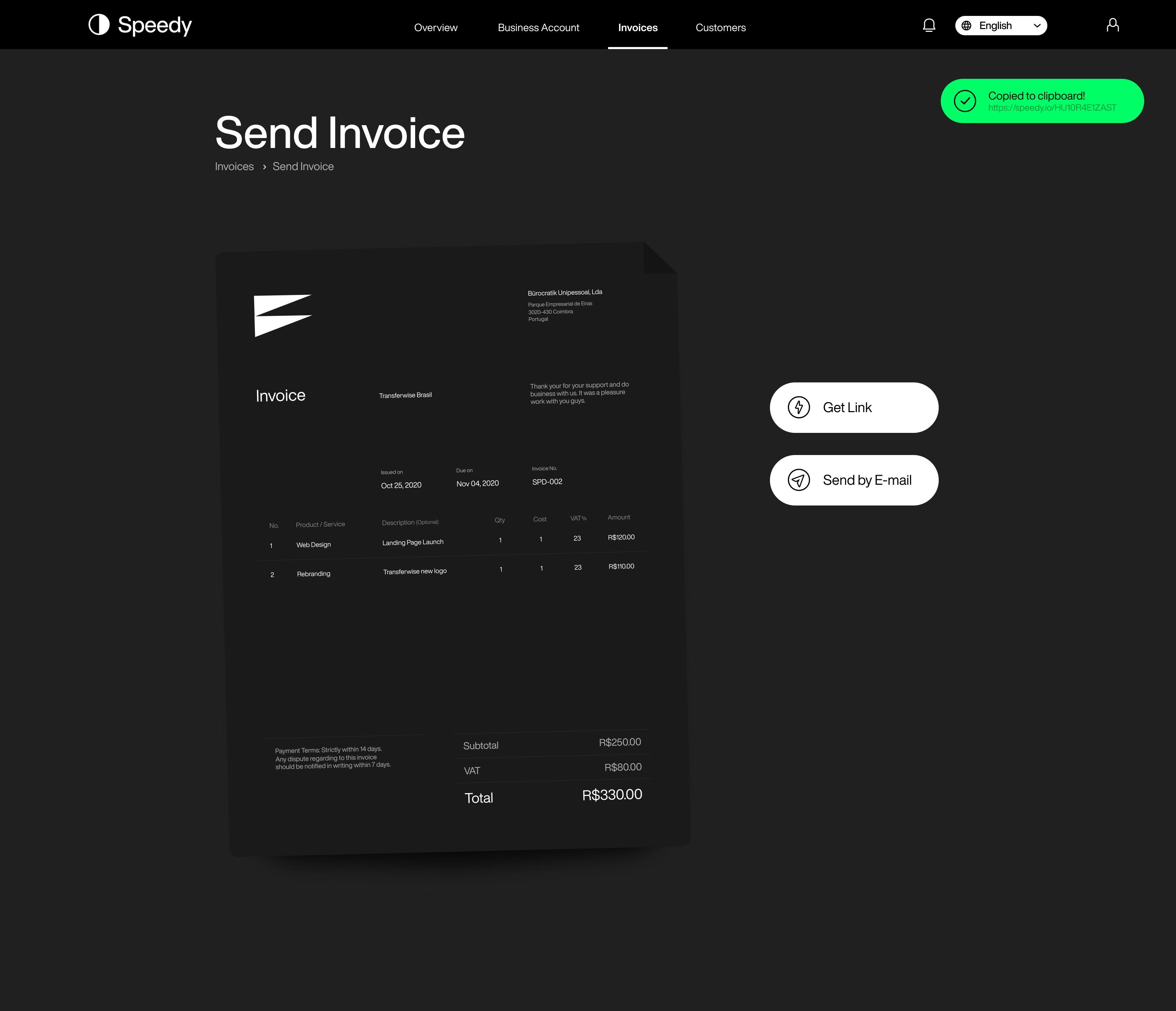
Speedy is one of our most comprehensive digital transformations—a full 360º branding effort, from naming to product design.
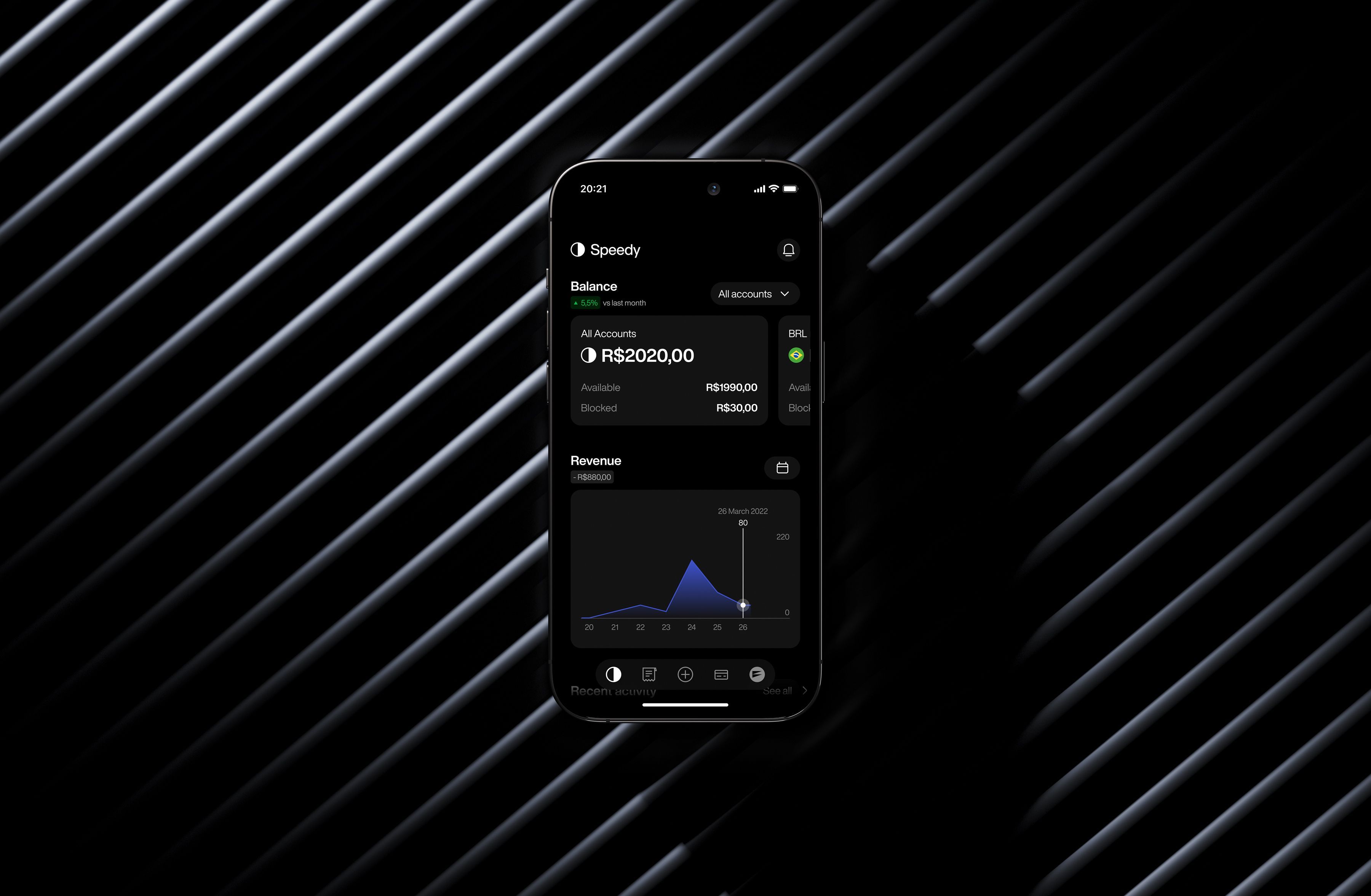
App
And here you have it: the native apps’ UI/UX with a dark and light mode. Chef’s kiss!
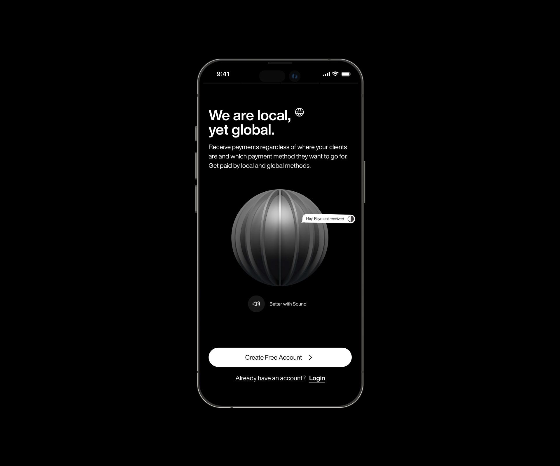
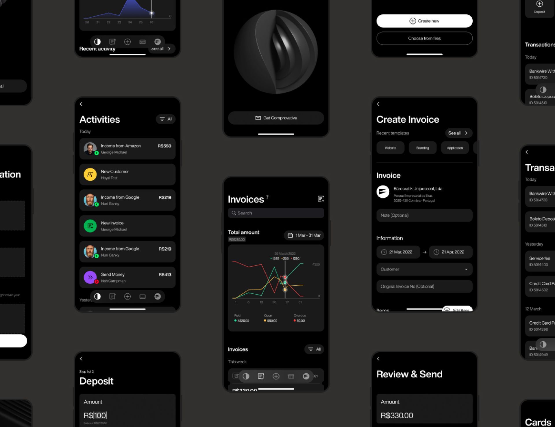
We know this is a long case study—just imagine the scrolling and clicking it took to bring the full project to life.
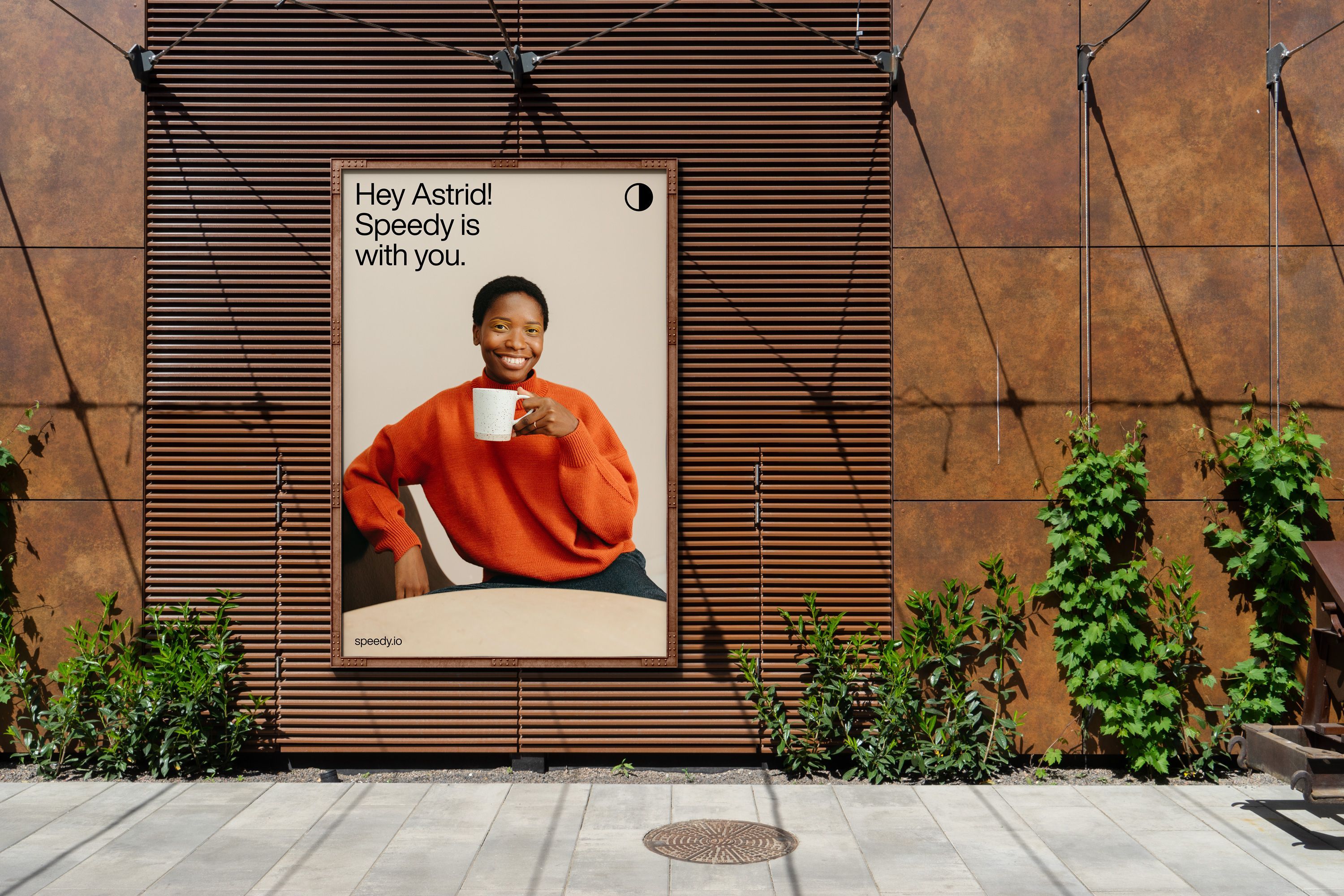
Rebranding
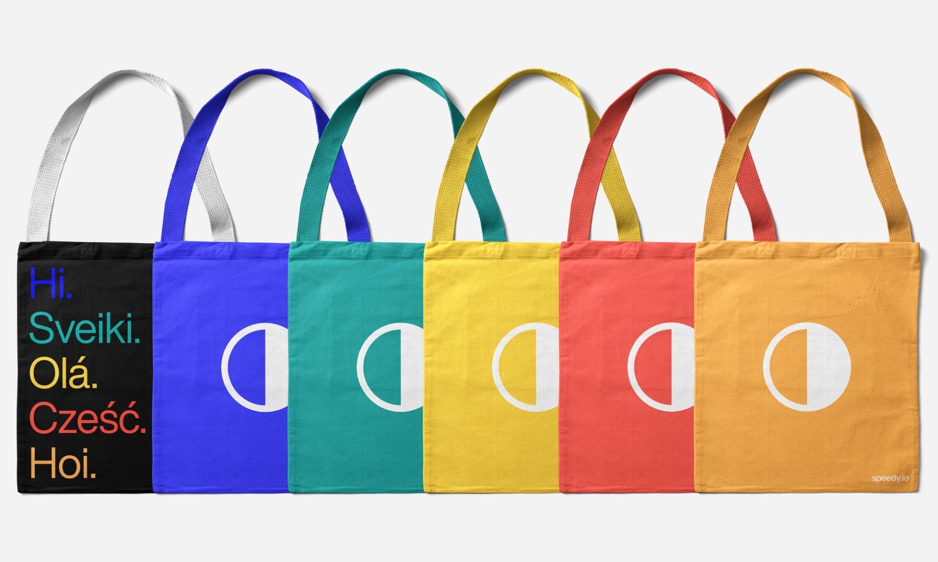
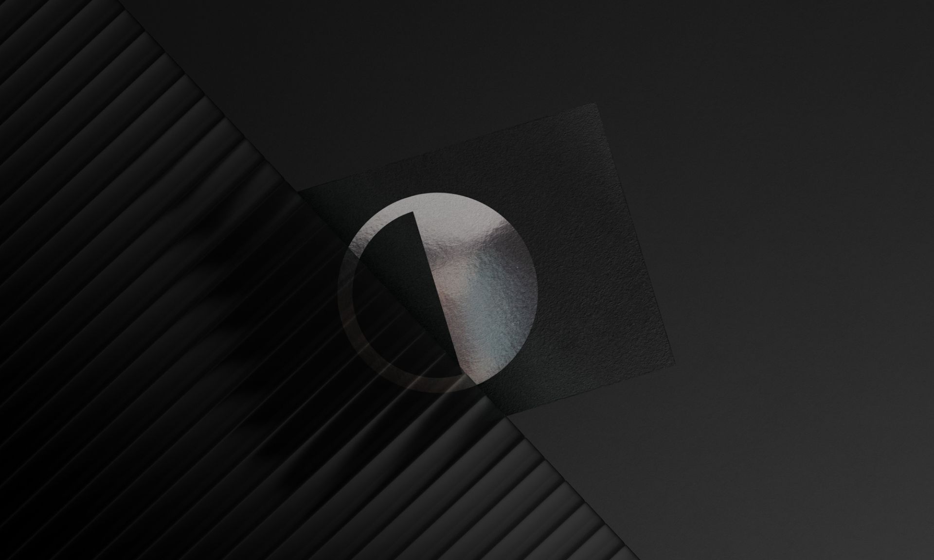
Some very smart people remind us there’s only one Earth—but there are countless globe logos out there, thousands of ways to interpret our beloved blue dot. We knew we needed to create another, but with a twist. So, we stacked slices (locals) to form a globe made up of individual pieces—our “Glocal” approach. In motion, this beautifully represents each local market, but for a static, flat logo (yes, flat!), we needed a reduced version that could still hold meaning—abstract yet symbolic, incorporating country colors like a modern flag users could pick on the website dropdown.
The chosen logo captures a single slice, representing local identity. While it might bring to mind your TV remote’s contrast icon, ours is vibrant—moving, colorful, and anchored in a dynamic brand universe. Identity is more than just a logo, and sometimes the most effective brands echo something familiar. Branding is tough, but hey, you already knew that, right?

Working with Büro was a blessing for us while we struggled to stand out in terms of design as an enthusiastic newcomer product in the saturated Fintech market. We were confident for our product and technology, but a crashing design was a different game requiring remarkable craftsmanship. They quickly understood our product and targets, collaborated passionately, and were always present when we needed additional support. The result was expectedly gorgeous. Thank you Büro!